

By Martien Lubberink*
In a dash for more transparency, the Reserve Bank has launched the Bank Financial Strength Dashboard. This is a truly innovative online tool for sharing prudential and financial information on New Zealand banks.
The Dashboard contains more than 100 individual metrics on the financial strength of banks. The RBNZ will update the information every quarter.
A world standard for bank disclosures?
Compared to other initiatives, the Dashboard stands out in user-friendliness and relevance. The Federal Reserve Bank of Chicago also offers bank data, … lots of it. However, the format is Spartanic. All data is in csv (comma-separated values) format, and data definitions are hard to understand. Perhaps the Federal Reserve expects others to summarise the data for the general public. However, I am not aware of any party transforming the U.S. bank data into a more palatable format. So, yes, the U.S. offers rich data, but you need a PhD to get your head around it.
The European Banking Authority (EBA) publishes rich data on banks too. However, it does so on an irregular basis. Once in a while for a transparency exercise. Once in a while for a stress test. This hampers time-series analyses, thus making it hard to assess developments in the European banking sector over time. The EBA data is also hard to figure. Every release of data has different data definitions.
So, yes, the Reserve Bank strikes a sensible balance by offering a relevant set of metrics on a quarterly basis.
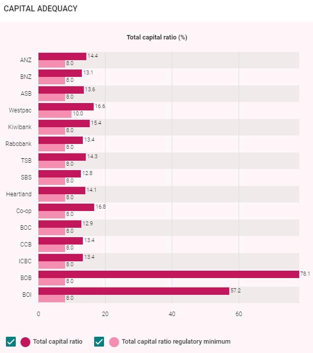
The Reserve Bank also acknowledges different users groups. For ‘casual’ users it offers eye-candy graphs, like the one below:
I, as a researcher, could not care less about the graphs. So, specially for me, the Reserve Bank offers the data in an Excel file. Thank you Reserve Bank!
The public also should thank the Reserve Bank for the Dashboard, as it displays animations that explain the metrics. The Dashboard and the Excel file show how the metrics are calculated.
Where is the ‘but’?
Is the Dashboard all hunky-dory? For sure, disclosures like this deserves following. But, in the current benign economic environment risks are building up. These risks may be hidden form the general public. My suggestion for the Reserve Bank would be to include stress test data. This way, the public would be able to assess our banks in good times and in bad times.
Apart from this caveat, thumbs up for the Dashboard.
(Interest.co.nz has also launched its own Key Metrics tool drawing on data included in the Dashboard. There's more on this here).
----------------------------------------
*Martien Lubberink is an Associate Professor at the School of Accounting and Commercial Law at Victoria University. He previously worked for the central bank of the Netherlands where he contributed to the development of new regulatory capital standards and regulatory capital disclosure standards for banks worldwide including Europe (Basel III and CRD IV respectively).
4 Comments
Given this was intended to help the average person on the street better evaluate the banks. I think it is a abysmal Failure. Quick check around the office, and no-one understood any of it.
A good dahsboard is meant to show a position and prompt behavior to improve it. This doesn't do either.
RBNZ Should be able to provide a simple ranking system in a non-biased fashion based on the quantitative data they have access to. They can then show the individual metrics used to determine the final result for people that want to drill down further.
That is a dashboard the general public will understand. It provides a position - i.e. where does my bank fit in, and it prompts a change in behaviour
- either the individual changes banks to a better ranked one. or
- banks change behavior to improve their ranking
Ideally it becomes circular. More people move to a better bank, thus lower banks become more responsible and entice customers....
Lol, scratch that last bit, for a minute there it looked like an actual competitive industry with the best interests of the customer at the forefront.
I like it, although most people still don't know what the OBR is.
Maybe it needs a more evocative click bait title like
"How crooked is your bank?"
"All banks are bad, but you won't believe No. 7"
"Govt gives thumbs up to banks stealing your money"
"Rank the banks! which one is worse?"
"Fail but no Bail, what NZ bank is going under?"
We welcome your comments below. If you are not already registered, please register to comment.
Remember we welcome robust, respectful and insightful debate. We don't welcome abusive or defamatory comments and will de-register those repeatedly making such comments. Our current comment policy is here.