By David Hood*
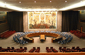
In late September, the Prime Minister linked economic benefits to getting a seat on the U.N. Security Council.
The great thing about a problem like this is that the answer is unknown, so any understanding people can bring to it is an improvement of what was previously known.
For the benefit of those wanting to practice at working this kind of thing out for themselves, I thought I’d outline my approach to figuring it out.
On the one hand, New Zealand getting on the U.N. Security Council is a pretty rare event, so we could pull some numbers out of the air in an estimated benefit of the Rugby World Cup kind of way.
But, on the other hand, individual countries getting on the U.N. Security Council is actually a pretty common thing. Five countries a year are elected. So with a bit of web searching, we come up with the IMF’s figures for GDP 1 and a list of dates of when countries were on the Security Council2.
As any way of adding insight is an improvement on what is known at the moment, I figure comparing six year blocks is good, arranged so that either a county got elected to the Security Council in year four or it was not on the Council at all in that block. I chose six year blocks because that is about the longest you could get without some countries being on twice.
If there is even a little improvement in a country’s GDP, you should see it show up among all countries.
The next step is to organize the data into a record of what calendar year the fourth year of the series was, note did they get on the Council, and record the percentage change over previous year in inflation adjusted PPP GDP for years 1 to 63.
Even knowing computers pretty well, this still took more than an hour, but one of the big things with data analysis is if you can get the data into the right form, answering the question is easy.
So, we do some calculations.
Average change in GDP for years 4-6 then subtract the average change in GDP for years 1-3. If the answer is positive, the country grew faster in years 4-6.
Average for all countries that got on the Security Council -0.007%, average for those that didn’t -0.002%. Well, that’s not looking so good since the Security Council countries on average did worse, but this is where the error stuff statisticians worry about becomes really important - does this difference matter.
If we look at a histogram frequency graph of how common are the differences in GDP for Security Council and non-Security Council countries are, we can see that really there is not much difference between the two.
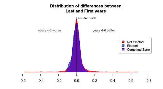
In more formal terms, the standard error of the Security Council countries is 0.037, the other countries is 0.055. For things that are normally distributed (and looking at the graphs, those shapes are fairly normal distributions) we can run it through a T-Test, which gives the odds of these basically being the same and the differences being unimportant as being 18.6%, which is sort of number you go “we can’t claim there is a difference”. Even if there was a real difference, it would be due to countries getting on the Security Council being a little worse than other countries, not doing better. So at the moment it is looking like getting on the Security Council offers zero economic benefit.
But let’s be thorough.
It is possible for the non-Security Council countries to be a flat line, while the Security Council countries were going downhill then pulled back up. This would show up as the same average but at least the Security Council countries would be improving.
Now, there are a bunch logical problems with this argument, but let’s stick to the data. To test it we can work out a line of best fit based on the first three years, and see how much the next three years rise or fall compared to the direction things were going in. Using three points to work out a line is horribly inaccurate, but we have more than a hundred cases for the Security Council and thousands for the non-Security Council, so we can look at the averages and expect the individual errors to balance each other out. And, fortunately, computers can calculate out all those lines.
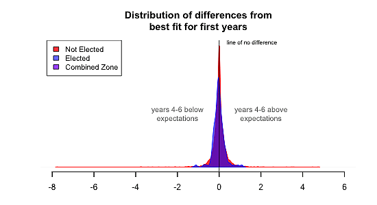
The results are that Security Council countries average 0.023% below the trend line, while non-Security Council countries average 0.005% below the trend line. But, as with look at the averages, in reality there is no difference. The T-Test results are that the differences were 44.6%.
Now, a couple of potential criticisms:
1) With year 4, countries are elected during the year so this year should not be included.
Answer 1) If you like, but the answer doesn’t change if you exclude year 4 and just use year 5 and 6. You can check that for yourselves
2) If I check a whole bunch of years, I find one that is better (10 years out, 20 years out, etc) for the Security Council.
Answer 2) If you check a whole bunch of years, by random luck you will find one that looks interesting, but that’s called cherry-picking your data to fit your argument and will get you mocked.
So there we have it. If at some point the government issues a report on the benefits, we have the tools to go “I’ll judge that for myself”.
-------------------------------------------------------------------------------------------
[1] IMF Gross domestic product based on purchasing-power-parity (PPP) valuation of country GDP. http://goo.gl/zKB7tV
[2] Elected Members of the Security Council http://www.un.org/en/sc/
-------------------------------------------------------------------------------------------
David Hood is a reader and commenter, and has spent many years helping people use their computer resources better and understand what their data is telling them. You can contact him here.
We welcome your comments below. If you are not already registered, please register to comment
Remember we welcome robust, respectful and insightful debate. We don't welcome abusive or defamatory comments and will de-register those repeatedly making such comments. Our current comment policy is here.