
 By Rodney Dickens I wrote the first "housing hell" report in August 2007. It looked at what was likely to happen to real or inflation-adjusted house prices after the mega-boom, using NZ and UK experiences. In that report I concluded that "to get the rental yield back to the historical average of 7.7%, the average rental income will have to increase 71% or the median house price will have to fall 42%. Or, more likely, some combination of the two will unfold." In the second "housing hell" report, written in March 2008, I looked in more detail at the extent to which house prices were out of line with incomes and rents. These reports offered valuable insights for anyone serious about understanding the underlying economics of the housing market, which has implications to the long-term performance of house and section prices. They were not designed to quantify near-term prospects for house prices, but these reports also provided advance warning of the imminent fall in house prices. House prices and, to a lesser extent, section prices subsequently fell and in time-honoured fashion the media was there to tell the horror stories. In a 6 January 2009 article on the front page of the business section of the Herald I was identified as picking that house prices would fall 42% in 2009 from the peak level in 2007. 42 might be the answer to the meaning of life, the universe and everything, but it wasn't my pick for house prices in 2009 (see here for my rebuttal).
Ironically, in our January 2009 pay-to-view Housing Prospects reports I wrote that "interest rate cuts should underwrite a sufficient upturn in housing demand in the first half of 2009 to halt the downward pressure on house prices" and that "by which time the national median price should have fallen 10-12% from the peak". Based on the QV quarterly house price index, which is the most accurate measure of house prices, the national average house price fell 10% from the peak in the December quarter of 2007 to the March quarter of 2009. By the time May 2009 rolled around I was predicting in our Housing Prospects reports that "price increases could emerge in some places before year end", which demonstrates that I am not the moribund pessimist some property people paint me as, and that the analytical framework I have developed over many years is just as useful for picking near-term upturns as it is for warning about near-term pain. However, as was the case with the earlier "housing hell' reports, the focus of this Raving is not on near-term prospects but is on the big-picture (i.e. how far along the adjustment process are real house prices). The left chart below updates the relationship between the national median house price and the national average annual gross rental income on rental dwellings that was shown in the first "housing hell" report. The fall in house prices in 2008 made a bit of a dent in the yawning gap between house prices and rents, which resulted in some improvement in the gross rental yield (blue line, right chart).
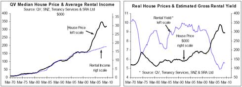
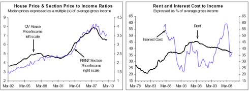
See a bigger version of the chart here. However, based on the REINZ data the national median house price in December was up 2.3% on the peak level in 2007, while the recession has contributed to a stalling of growth in rents. The QV quarterly house price index is currently only available up to the June quarter of 2009, but when we finally get to see the March quarter of 2010 number it is likely to confirm that the rental yield has fallen almost back to the trough level experienced when house prices peaked in late-2007. Rental yields are useful in helping assess whether housing in general represents a good investment. However, the rental yield shouldn't be viewed in isolation, but rather in the context of interest rates (both from the perspective of the cost of debt for housing investors and from an opportunity cost or alternative investment perspective), the prospects for rental growth and the prospects for capital appreciation. 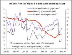 See a bigger version here. This chart shows that there is not a close relationship between the housing gross rental yield and two measures of interest rates. However, in the longer-term it is reasonable to expect the housing rental yield to average significantly above the 6-month term deposit rate, reflecting the higher risk normally associated with investing in housing relative to putting your money in the bank. Equally, the rental yield will not remain significantly below the average fixed mortgage interest rate over the long-term because this implies that housing investors will be too cash-flow negative for this to be sustained indefinitely. However, while interest rates remain below average a below average housing rental yield can be justified. Another perspective on house and section prices is how they stack up relative to incomes. The left chart below shows the ratio of the national average house price to the annual gross income of the average employee (black line) and the section price to income ratio (blue line). With house and section prices currently increasing and income growth having slowed the price to income ratios will be rising. Relative to incomes, house and section prices are unsustainably high. However, disequilibrium, like house and section prices being unsustainably high relative to incomes, won't necessarily be resolved quickly. This is especially the case in property markets where prices can be downwardly "sticky" (i.e. if there aren't lots of forced sellers prices can hold up much better than implied by an adverse demand-supply balance). The super-low interest rates that resulted from the financial crisis have played a major part in waylaying the adjustment in real house and section prices. The right chart is most useful in showing this. The blue line is the annual interest cost associated with buying the average house using 80% debt, expressed as a % of the average employee's gross income. The black line is the annual cost of renting the average rental dwelling, expressed as a % of the average employee's gross income. The RBNZ's experiment with low interest rates between 1999 and 2005 played a key part in making buying a house (including building a new house) much cheaper than renting, which helped fuel the speculative bubble in house prices between 2003 and 2007. Rising house prices and increasing interest rates eventually made buying a house look very expensive relative to renting, which created the economic/financial backdrop for the larger than normal cyclical fall in house prices in 2008-09. However, the combination of falling house prices and especially tumbling interest rates has provided a temporary reprieve and given housing a veil of affordability.
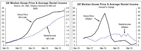
See a bigger version here. Since house prices peaked in late-2007 we estimate that the average employee's income has increased 11.5%, while we estimate that the average rent has increased 4.5%. This means that even with the national average house price rebounding some progress has been made in closing the yawning gap between house prices and incomes. 42% is no longer the answer to how much house prices would have to fall in real terms to restore sanity, but from a fundamental/valuation perspective, housing in general now offers almost as bad value for investors as it did in late-2007. This doesn't mean house prices are about to collapse, although it does mean house and section prices are more vulnerable than normal to rising interest rates and economic downturns, while it also means it will be a long, long time before housing in general is a good investment option again. The medium to long-term outlook for real house and section prices Since the inaugural Housing Prospects report in April 2007 we have demonstrated our ability to provide valuable insights into year-ahead prospects for house and section prices. Our unique analytical framework has proved its ability to pick both when prices are about to rise and when they are about to fall. However, in assessing what will happen to house and section prices over the next 5-10 years our leading indicator framework doesn't have the answers because by design it can only assess near-term prospects. No one can say with certainly what will happen to house and section prices over the next 5-10 years, in part because we are in uncharted waters, but history and clear thinking can provide some helpful insights. The largest boom in house prices prior to the most recent one was in the early-1970s. The left chart shows what the average house price did relative to the average gross rental income during the 1973-74 boom. The right chart shows the performance of annual house price inflation relative to inflation in rents. This was a period when prices in general were increasing dramatically, with consumer price inflation averaging 12% over the 1970s and 14.4% in the second half of the decade, which was almost matched by inflation in rents. In the first half of the 1970s the national average house price increased 56% relative to prices in general as measured by the CPI (i.e. the real or inflation-adjusted house price increased 56%). However, during the second half of the 1970s the real house price fell 37%. In real terms house prices fell 2% in the 1970s (see the blue line in the second left chart below). High general inflation meant the yawning gap between house prices and rents could be largely closed even with house prices continuing to rise. But what ultimately matters for investors is the performance of house prices relative to prices in general and on this front investors got burnt big-time in the second half of the 1970s.
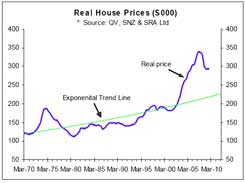 See a bigger version here. Estimating the long-term trend line for the national average real house price is fraught with potentially dubious assumptions, but the green line in the adjacent chart is my guestimate. This trend line has an annual growth rate of 1.52%. See a bigger version here. This is a lower estimate of annual real house price inflation than assumed by some property people. In my experience many people are too optimistic about things like sustainable economic growth rates and long-term real house price performance, either because they have a vested interest or because they have estimated them over non-representative time periods. Based on my guestimated exponential trend line, the real house price would have to fall 25% to be back on the trend line. A major difference between now and the 1970s is that the RBNZ is now responsible for ensuring that general inflation remains relatively low. This greatly reduces the extent to which or the speed with which rising rents and incomes can close the yawning gap. Population growth is the key driver of rising real house and section prices over the long-term. On the seemingly realistic assumption that NZ continues to have around 1.2% annual population growth, the trend line should continue to increase at around 1.5% per annum. This means that the longer the gap takes to close the less real house prices will have to fall to get back on the trend line. For example, if it takes another 5 years for the real house price to fall back to the trend line, real prices will only have to fall 19% to restore sanity. However, I expect the adjustment to take longer than five years because actual prices are downwardly sticky and general inflation in incomes and rents is likely to be much lower over the next five years than was the case in the second half of the 1970s. If it takes 10 years for real house prices to fall then only a 13% fall will ultimately be required from the current level to restore sensible prices. But it shouldn't be overlooked that real prices can fall below the trend line for sustained periods as well as run above it. This has direct implications for the medium to longer-term outlook for section prices. Downwardly sticky property prices and the role of human behaviour/stubbornness If the housing and section markets behaved like the share market, or like any other markets in which prices respond rapidly to changes in the demand-supply balance, the adjustment in real house prices would have occurred. The difference with property markets and other markets with downwardly sticky prices is that during downturns many vendors are only pretend vendors (i.e. they have properties listed for sale but are not willing to sell at the prices required to achieve sales and "clear" the market). See here for a discussion of market clearing prices. In a 15 January article in the Dargaville News, Massey University lecturer Bob Hargreaves was reported as identifying psychology as a key factor behind why property prices haven't come down that much. "It's a psychological thing, people that brought their properties at the height of the property boom don't really want to sell at a loss, so you've got people just sitting there holding onto their properties." He was also reported as suggesting that low interest rates were another reason for property prices staying relatively stable. He went on to warn that "interest rates will go up before they'll go down again." Unless there is a large number of forced or mortgagee sales, house and section prices will be downwardly sticky. In the context of the high level of debt some people have and the depth of the economic recession that lasted from the March quarter of 2008 to the March quarter of 2009, the surprise to me was how few mortgagee sales there have been. Relative to the size of the housing stock NZ has experienced a small number of forced sales compared to the US. This is why I expect much of the gap between house and section prices on the one hand and incomes and rents on the other hand to be closed more by incomes and rents grinding higher than by actual house and section prices falling. However, actual house and section prices remain vulnerable and future Housing Prospects reports will update our insights for these. Our in-depth research in 2009 revealed major differences in the downward stickiness of house and section prices in different parts of the country. In our assessment the differences were due to varying levels of mortgagee sales as much as because of different demand-supply balance, although the latter is also playing a part. The charts below come from our recent One-Tree Point-Ruakaka-Marsden Point report and show section sales data for a sub-market where large adjustments have occurred.
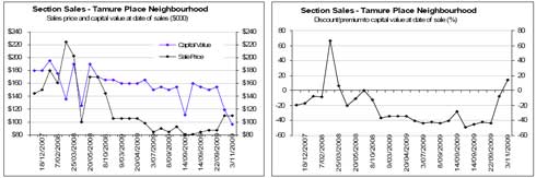
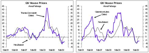
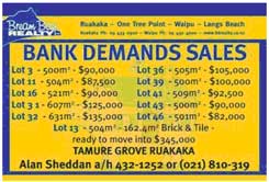 See a bigger version here. Tamure Place is accessed via a lower socioeconomic part of Ruakaka. Prior to the bubble really bursting in early 2009, sections were already generally selling at discounts to capital values, but the combination of collapsing demand and mortgagee sales meant the discounts subsequently averaged around 40%. The left chart above shows selling prices relative to CVs at the time of sale, while the right chart shows the % premium or discount to CV. See a bigger version here. The adjusted sign is from a current ad for the same area, where mortgagee sales continue, which has resulted in new, lower benchmark prices being set. This is an area where I expect demand for the sizeable number of new sections that have been subdivided to ultimately come mainly from local workers. In that context, section prices in the $82,000-100,000 range make sense versus the $140,000-170,000 range "“ and higher in some cases "“ they were initially priced at. In places where mortgagee sales have made up a sizeable share of total sales some significant price adjustments have occurred. In some other places where the demand-supply balance might be just as unfavourable but mortgagee sales are less common, the adjustment process is at work, but it has some way to go before sanity prevails. The Thames-Coromandel District and the Queenstown Lakes District are two of the 24 cities/districts we cover in the Housing Prospects reports where adverse demand-supply balances are belatedly starting to manifest in significant underperformance of house prices relative to the national average (the charts below). We expect the underperformance in these two districts and in some of the other 24 cities/districts we cover to continue, but equally some other parts of the country have good reason to out-perform the national average.
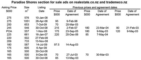
See a bigger version here. At the other extreme are some places where reality remains suspended despite there being an adverse demand-supply balance because would-be vendors are in no hurry to meet the market. In these places asking prices are generally well above what buyers are willing to pay, resulting in a small number of sales. In these situations only the buyers who are willing and able to pay premium prices are buying. This means prices remain well above the levels needed to clear the market and would-be vendors can live in a suspended state of reality believing they should continue to hold out on their asking prices. But while prices continue to defy gravity only a few of the would-be vendors will be able to sell. An example of this is in the Ruakaka area. We also found examples of this in Tauranga, as will be covered in a forthcoming pay-to-view report. In the Ruakaka Beach area, we initially found 23 sections for sale on the secondary market and 62 sold but vacant sections. The Ruakaka Beach area has direct access to the beach, has a significant retirement element as well as a higher income element, which is a major distinction with the Tamure Place neighbourhood. Sections and houses in this area have generally sold in the vicinity of CVs, but it is a relatively illiquid market in which vendors are asking prices above what most buyers are willing to pay. On searching www.realestate.co.nz and www.trademe.co.nz yesterday I found 13 sections advertised for sale in the newer part of the Ruakaka Beach area. The table lists the asking prices, section sizes, most recent listing dates (a number of these sections will have been re-listed, so will have been on the market for longer than the dates suggest). The table also shows previous sale prices and agreement dates for the sections that we were able to identify the exact address. Compared to original sale prices in 2003-04, asking prices are on average 152% higher based on the 6 sections for which we could make this comparison. Prices in 2003-04 may have been cheap, but the fact that many of these sections have been for sale for some time tells us that asking prices are too high to clear the market. This is an example of a place/sub-market where there will probably be a protracted adjustment in real property prices.
See a bigger version here. Many people seem to have little or no understanding of opportunity costs. An example helps explain the principle. If one of the vendors had dropped his/her asking price by 20% at the beginning of 2009 and as a result achieved a sale, the person could stop paying rates and upkeep on the section but, more importantly, he/she could have freed up money for use in other areas. In an extreme case the person could have invested the money in the NZ share market where around a 50% return was available last year, although this only stacks up if there was little or no debt on the section. The more relevant opportunity costs for many would-be vendors relate to the holding costs and inflation. The holding costs are straight forward and include interest on any debt, local body rates and any maintenance involved on the vacant sections, like lawn mowing costs. If, for example, a section that originally sold for $85,000 still has $50,000 debt associated with it, then annual interest costs would be around $3,500 (i.e. enough to pay for renting a decent holiday home for around 25 nights a year). Inflation is a creeping thing that moves slowly but will eventually mean people who wait years to sell will be worse off than they probably realised. For example, if prices in general rise 3% per annum then over a ten year period they increase by 34%. If it takes this long for a would-be vendor to achieve his/her asking price then on a purchasing-power basis the person will end up making a significant loss. Such a loss feels less painful than accepting a lower actual price today, but ultimately it will be as real. The Ruakaka Beach example shows that the psychology in question is more than just about people who bought their properties at the height of the property boom not being willing to make a loss "“ the physiological phenomenon explained by Bob Hargreaves. A number of the would-be vendors in the Ruakaka Beach area bought before speculative buyers drove prices to unsustainable levels, so they could sell at major discounts to the current asking prices and still make large paper profits. The behaviour by would-be vendors partly relates to what they paid for the sections, but it probably relates more to the value they perceive the land/property to have. Perceived value is generally based on recent sale prices, which is where we get caught in a Catch 22. If the vendors in general stick to their asking prices then only a few sections will sell, with the achieved prices reflecting what the most enthusiastic buyers are willing to pay, which will be well above market clearing prices. So most would-be vendors will not be able to sell at the achieved prices. _________________ * Rodney Dickens is the Managing Director and Chief Research Officer for Strategic Risk Analysis (SRA), which is a boutique economic, industry and property research company. Rodney produces regular free reports on topical issues and on specific property markets. Find out more about SRA here and sign up to SRA's free reports here.
We welcome your comments below. If you are not already registered, please register to comment
Remember we welcome robust, respectful and insightful debate. We don't welcome abusive or defamatory comments and will de-register those repeatedly making such comments. Our current comment policy is here.