

sign up log in
Want to go ad-free? Find out how, here.

From an internationally consistent dataset, we compare food spending across twelve reference countries to see how out of line we actually are

Economy / analysis
From an internationally consistent dataset, we compare food spending across twelve reference countries to see how out of line we actually are
food-pricesrf5.jpg
Source: 123rf.com

The cost of living is always a pressure point for many households.

Perceptions of "what groceries cost" drives fundamental sentiment about wellbeing. As as such it is always a political issue, and in election years, an election issue.

That is so even if the data shows that both food and grocery costs aren't actually rising faster than overall inflation. Political forces accentuate the fears, trying to make it 'true'.

Regular readers will know we cover these issues closely here. Not only in the official inflation stats and the official household spending data (the Q3 Household Living Cost data is due out at the end of October). We also follow the Infometrics/Foodstuffs supplier cost monitoring. And we have our own grocery basket monitoring. All these measures are consistently showing the same overall result of tame increases recently, even though they all come using different data sets from different angles.

But we recently stumbled on another view - an international one. This one is by the USDA and tracks food costs as a share of all household spending, across 155 countries. We have extracted their data to compare how New Zealand benchmarks against eleven other countries. 

For food costs as a share of all household spending, this is what it shows.
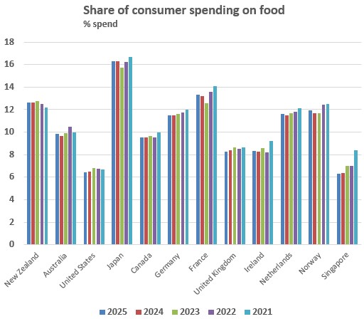
 

New Zealand households spend about the same share of all spending as in the Netherlands and Norway, a lot less than in Japan, and a bit less than in France. But in most other much larger countries we spend more. The obvious exception is Ireland, but they are so closely integrated into their neighbour the UK and into the EU, it perhaps isn't a surprise that they piggyback scale advantages.

We often feel we are disadvantaged compared with Australia. However many readers probably thought is was more than this data shows.

An here is a comparison of what these households spend in dollar terms. In this case, it is USD.
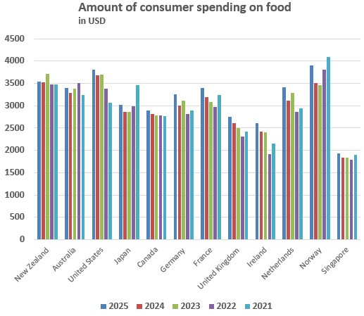
 

Here our disadvantage isn't as much as you might assume. The issue is more that our household spending on other stuff (other than food) is less, mainly because we have lower incomes. However isolating the food aspect, we spend very similar amounts as households in Australia, Germany, France, the Netherlands - and less than in the US and Norway.

It is also interesting to observe that in most of these countries, food prices rose notably from 2024 to 2025 - but not in New Zealand.

It is just another perspective from an independent long-run source. Draw your own conclusions.

We welcome your comments below. If you are not already registered, please register to comment

Remember we welcome robust, respectful and insightful debate. We don't welcome abusive or defamatory comments and will de-register those repeatedly making such comments. Our current comment policy is here.

2 Comments

Thanks for this. 

Up
0

Excellent information thanks.

I asked Google Gemini a few questions to try and extract some correlations, pasted below-

'Based on global economic datasets like those from the USDA Economic Research Service (ERS) referenced in the article, the primary driver of food spending as a percentage of household expenditure is overall national wealth (GDP per capita / average income), rather than a country's physical population size or its sheer distance to global markets.

Here is how population and distance factor into food prices and spending shares globally:

1. Country Population

  • The Correlation: There is no direct or strong correlation between a country’s total population size and the percentage of household budget spent on food.

    Why: High-spending shares on food are found in countries with low average incomes, regardless of whether they are massive (like Nigeria or Pakistan) or small (like various developing island or landlocked nations). Conversely, wealthy nations with low food spending shares also vary wildly in population—from small nations like Norway, the Netherlands, and Ireland to mid-sized ones like Australia and New Zealand, and massive ones like the United States.


  • Exception (Scale Economies): While population size itself doesn't dictate food costs, domestic market scale can play a minor role. Highly populated countries often have larger domestic supply chains and more intense local retail competition, which can drive down overhead costs. However, small nations deeply integrated into international trade (like the Netherlands or Ireland) easily bypass this disadvantage.


2. Distance to Markets (Isolation and Transport Costs)

  • The Correlation: Geographic isolation (distance to major global trade hubs) theoretically adds freight and shipping overhead, but in practice, it has a surprisingly minor impact on final consumer food spending percentages in developed nations.

    Why New Zealand and Australia are prime examples: Both countries are geographically isolated from major North American and European markets. Yet, as the USDA data shows, New Zealanders and Australians spend a comparable share of their household budget on food to wealthy continental European nations and the US.

    The Real Bottleneck: For isolated or island nations, the primary driver of food prices isn't necessarily the international shipping distance of imported goods, but rather domestic supply chain efficiency, local market competition (or lack thereof, such as supermarket duopolies), and local regulatory/compliance costs. Furthermore, because countries like New Zealand and Australia are major agricultural exporters, they produce a massive amount of food locally, insulating consumers from the raw cost of international transport for core staples like dairy and meat.

The Ultimate Determining Factor: Income

The overwhelming macroeconomic rule governing these statistics—known as Engel's Law—is that as a household's (and a country's) income rises, the proportion of income spent on food drops drastically, even if absolute spending in dollar terms increases.

When comparing wealthy nations like New Zealand, Australia, the US, and Western Europe, differences in the % of GDP/household spending on food come down to disposable income disparities and local housing/living cost pressures rather than population size or shipping miles.

Up
0