
With apologies to Visual Capitalist, here is their graphic on how the world economy will shape up in 2025.
It is based on IMF data.
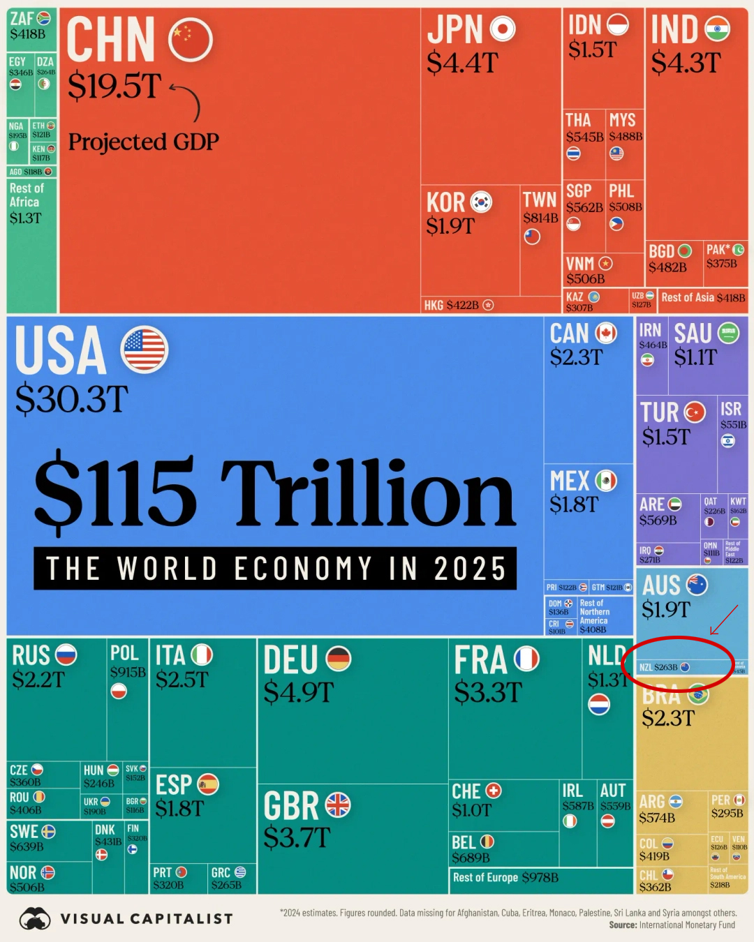
Australia is an also-ran economically. New Zealand is substantially less than that.
This is why we need to keep an eye on the major economies. Their influence on us is enormous.
| Rank | Country | Region | 2025 GDP | |
|---|---|---|---|---|
| US$ | % | |||
| 1 | US | Northern America | $30.3 tln | 26 |
| 2 | China | Asia | $19.5 tln | 17 |
| 3 | Germany | Europe | $4.9 tln | 4.4 |
| 4 | Japan | Asia | $4.4 tln | 3.8 |
| 5 | India | Asia | $4.3 tln | 3.7 |
| 6 | UK | Europe | $3.7 tln | 3.2 |
| 7 | France | Europe | $3.3 tln | 2.9 |
| 8 | Italy | Europe | $2.5 tln | 2.2 |
| 9 | Canada | Northern America | $2.3 tln | 2.0 |
| 10 | Brazil | South America | $2.3 tln | 2.0 |
| 13 | Australia | Oceania | $1.7 tln | 1.5 |
| 55 | NZ | Oceania | $263 bln | 0.2 |
| Global economy | $115 tln | 100 | ||
7 Comments
"Once upon a time there was a government that adopted a goal of catching up economically with Australia by 2025."
kikwikidsnz,
Once upon a time there was a government that adopted a goal of catching up economically with Australia by 2025."
Yea Right and didn't the same John Key vow to turn NZ into the Switzerland of the S Pacific? What he really meant was that we should become a major player in the tax haven world. That was before the Panama Papers revealed the extent of our involvement in just that world. The Laundromat by Jake Bernstein is worth a read.
"didn't the same John Key vow to turn NZ into the Switzerland of the S Pacific"
Maybe J.K. was looking at house prices in Switzerland? We're well on the way to such prices. A return to feudalism.
What he really meant was that we should become a major player in the tax haven world.
The ruling elite could have set up the nation as a tax haven for the digital assets space. I'm relatively ignorant as to how our current situation is as to setting up an offshore company domiciled in Aotearoa that could have BTC, etc on its balance sheet. It possibly can be done but I haven't researched it properly. Instead of charging fiat fees, we could charge in BTC and add that to our national balance sheet.
If we were really concerned about money laundering, there could be appropriate KYC processes. Anyway, the Ponzi is partly a money laundering vehicle. Nobody gives a rats as long as the prices rise.
If the US government suddenly stops deficit spending - and let's not forget it is Congress that holds the purse strings, not the President - then all hell will break loose. (And China could decide to inflict more pain on the US by pulling back on their 'stimulus' as money looks for a more stable home.)
And we all thought 2024 was bad ... ;-)
For those who can't see:
1) China estimated loss in housing wealth: 100% of GDP - US$18 trillion
2) NZ estimated loss in housing wealth from peak to trough: 90% of GDP
Is size the determining factor however? An economy can be small, but balanced. Perhaps the real solution is a reversion to the control of capital flows?
We welcome your comments below. If you are not already registered, please register to comment
Remember we welcome robust, respectful and insightful debate. We don't welcome abusive or defamatory comments and will de-register those repeatedly making such comments. Our current comment policy is here.