

Today's Top 10 is a guest post from Matt Nolan.*
As always, we welcome your additions in the comment stream below or via email to david.chaston@interest.co.nz.
And if you're interested in contributing the occasional Top 10 yourself, contact gareth.vaughan@interest.co.nz.
See all previous Top 10s here.

Although it is nearly impossible to walk somewhere without tripping over research on the distribution of income in the United States, New Zealand is a very different country that has faced very different changes.
So I thought I’d share with you 10 of the most interesting pieces I’ve found discussing New Zealand that have helped me to gain an appreciation of what has happened – but only with an early health warning.
The fact incomes are different (and therefore, unequal) does not immediately imply that incomes are unjust.
Here my only focus is on what has been said about what income inequality is and what we can tell about why it is the case – arguments about what is right and wrong are significantly more complicated, and largely lead to situations where people try to yell on top of each other.
I’ll leave the conversation about what is right and wrong for other people, my only goal here is to try to distill down some information.

1. Describing Inequality: Ministry of Social Development’s Income Report
Each year a new Income report from MSD (written by Bryan Perry) is released. This provides the most comprehensive and up-to-date run down on income inequality trends, along with a sizable discussion of poverty measures and wealth inequality.
The take-outs of the report with regards to income inequality are:
- Income inequality, as measured by the Gini coefficient, rose strongly during the late-1980s and early 1990s but has been virtually unchanged during the past decade.
- Given housing costs are difficult to avoid, especially for those on lower income, looking at income after housing costs are removed is useful – especially given the regional differences in housing costs.
- On the face of it the lowest deciles (those earning the lowest income in a year) have not done too badly – however, this hides compositional differences, with those on National Super and those on low in-work incomes seeing strong income growth while the real value of benefits have stagnated.
- Strong household income growth has been partially due to increasing female labour force participation.
As the author states in the report, the purpose of the Incomes Report is to describe trends in income inequality and how income is distributed across New Zealand households – not to explain how New Zealand got there, what trade-offs exist from government policies, and not to suggest what the government should do.
Before we can even start to consider these questions we need to dig into these numbers a bit more deeply to see what we know about potential “causes” of this change. Note that there are many potential explanations that I won’t cover here– but by looking at a few issues, we at least have a neat starting point for chatting about the issues.
Pre-2000’s
There have been a number of studies focused on income inequality in New Zealand prior to the 2000s, mostly relying on Statistics New Zealand’s Household Economic Survey (HES).
There is a tricky disconnect between what income inequality is and what we often care about when we talk about inequality. When talking about policy we often care about differences in people’s claim on real goods and services – whether we frame this as a concern around outcomes, or the individual/family/household’s opportunity to claim and create resources.
This inequality in terms of consumption (and peoples willingness to trade-off between measured consumption and non-measured consumption, such as time off work to work on the garden) is related to income inequality – but can differ when the relative price of different products change, types of income and consumption aren’t measured, and due to the fact that consumption and income generation for an individual happen at different times (as we can save and borrow).
The studies mentioned below try to deal with elements of this. Furthermore, many of the results were summarised by Des O’Dea in 2000 – although at the time some of the research was not yet complete.

2. Considering the spread of income by income type
One common way of considering income inequality is to look at sources of income – rather than looking at the income of individuals directly. A key proviso to keep in mind here is that many of us rely on multiple income sources over our lifetime, so interpreting these numbers can be a bit difficult.
In 2002, Nripesh Podder and Srikanta Chatterjee looked through self-reported income source data from Statistics New Zealand’s Household Economic Survey for the 1984-1996 period. By doing so they are able to break down how changes in the Gini coefficient for income (as a measure of income inequality) is due to changes in the source of income (eg benefit income, wage income, investment income).
The sharp increase in unemployment over the latter part of the 1980s and early 1990s while, again, not a direct cause of increased inequality, has certainly contributed to the process. Likewise, the distortions in the financial markets, which saw the nominal interest rates soar to unprecedented levels in the later 1980s and early 1990s, resulted in changes to household incomes in a way that, again, contributed to the increased inequality.
Interestingly too, whatever the positive outcome of the changes in the tax expenditure policies over the period of the reform, they contributed to increased income inequality.
Outside of this the paper also indicates that changes to benefit rates and globalisation/technological change may well have played a role in explaining the ways sources of income changed.
Although the exercise of breaking down shifts in the income distribution into the types of income that is generated is a useful exercise, in this instance I find the willingness to attribute the changes to the reform without further analysis a bit weak. The discussion of financial markets is especially fraught – the high nominal interest rates occurred in the face of high levels of inflation and nominal wage growth, implying that we really need to pull inflation out before making such claims!

3. Ethnicity and population groups
Rather than just looking at sources of income, it can be interesting to consider different subgroups of the population. Such a breakdown can tell us about the ways that inequality between these groups contributes to overall inequality, and how much inequality exists within certain groups of people.
One common population breakdown for all economic and social questions is one based on ethnicity, given that there are often structures within society that may lead to otherwise equivalent individuals from different ethnic groups experiencing very different outcomes.
In 2007, Chatterjee and Podder also discussed this issue, looking at data from the 1984-1998 period:
Our findings suggest that (a) the average incomes of the ethnic groups are strongly dissimilar – the average income of the pakeha group being substantially higher than that of each of the other groups; and (b) the intra ethnic-group variations in incomes, as measured by the within-group Gini coefficients, is much smaller for the Maori and Islander group than it is for the pakeha.
The suggestion here is that average income for European New Zealanders is higher than for those of Maori or Pacific Island descent (between group inequality), but that inequality among Europeans is also higher than among other groups (within group inequality). Exactly what this means is a difficult issue – is it a case where there is a group with significant claim on income, and is this group defined by race or some other characteristic?
When it comes to considering ethnic issues, an important part to consider is how the groups incomes “overlap” – in terms of members of one ethnic group earning more or less than other ethnic groups. The greater the overlap, the less race based inequity is likely occurring.
One encouraging part of much of the literature on ethnicity has been the increase in income overlap between 1984 and 1998. However, this paper contends that this is largely due to changes in the population shares (the rising relative size of Maori and Pacific Island populations) and that when we correct for this there has been no improvement.

4. Graphical measures of inequality: Lorenz curves
During 2002, Chatterjee and Podder took another tack in analysing changes in income inequality in New Zealand during the 1984-1998 period, focusing on a concept called generalised Lorenz dominance.
We don’t want to get into too much detail here, but the idea of Lorenz dominance between two years is that, for a fixed average level of income over the population a split in income that is more equal will Lorenz dominate another split that is less equal – as long as the level of inequality is seen as a negative thing.
Of course, average income generally rise over time – so we want to generalise what we are looking at. Generalised Lorenz dominance moves away from only looking at the relative income of individuals, and also takes into account differences in the amount of income earned.
Using this method they look at four years, 1984 (pre-reforms), 1992, 1996, and 1998. They show that 1998 dominates all the other years, but that 1992 tends to be dominated by all other years. They then state that the choice of distributions in these different years was largely a policy choice – this is much more debatable. And even if it was a policy choice, in the longer term there is a question of whether New Zealand was on a sustainable path – would we have eventually been forced into drastic changes at a less opportune moment?
This broader concern about interpreting changes during the reforms as primarily due to the reforms themselves is in part supported by a 2007 paper by the same authors in conjunction with Paul Dalziel and Sven-Olov Daunfeldt. Here they found that the more extensive reforms in New Zealand, as compared to Sweden, did not seem to lead to a comparatively larger increase in the inequality of incomes.
Note: Dalziel 2002 and Quiggin 2000 both state that the more intensive reforms in New Zealand relative to Australia was part of the reason for our relative under performance to Australia during the 1990s. However, this was a discussion regarding the level of incomes (not inequality), relied on very different data, and is also highly argued about in the literature – the research by the Productivity Commission on comparing Australia and New Zealand is about trying to disentangle the reason for these differences in performance. I am just noting it here so no-one thinks I’m ignoring it!

5. How do our differences drive “income inequality”?
The analysis of income and population subgroups, and Lorenz curves, that we have discussed above are useful descriptively – but as we noted they are still hard to interpret. In order to help tease out this puzzle we have to look even more deeply at the types of underlying changes to the fabric of society that have occurred, to determine whether they have contributed to the lift in inequality through the 1980s and early 1990s.
A paper by Dean Hyslop and Dave Mare, that is incredibly popular in the New Zealand economic community, (an early version here) attempts to explore this issue by estimating how the income distribution (in terms of gross household income) would have looked if certain social and demographic factors had not changed. The factors considered are: changes in household structure (eg how many people living in a house, how many are children) changes in sociodemographic characteristics (eg age, sex, ethnicity), changes in the return to these characteristics, changes in employment outcomes, and changes to National Superannuation.
Although it is important to keep in mind that this doesn’t tell us what caused the changes, it does give us more of an impression of what the change in income inequality measures actually mean, by showing that the change in income inequality was related to underlying changes in society.
So what do the authors find:
Examining income inequality across all households, we find that the main factors which contributed to the change in inequality were changes in family and household structure (primarily a pronounced drop in the fraction of two parent households and a rise in the fraction of sole parent households), and changes in the socio-demographic attributes of households.
However, as is often the case it is important not to view these as “causes” of the changes we’ve observed – this just tells us that the observed change in income inequality was associated with changes in these factors.
Why is this distinction important? Let us consider the increase in sole parent households – what does this tell us? Does it tell us that rising observed income inequality is due to a breakdown in the institution of marriage and falling opportunities for those with children? Does it tell us that falling stigma about raising a child alone is allowing people to do it alone instead of staying in abusive relationships? Does it tell us that living standards are rising in such a way that sole parents are now able to have their own separate housing rather than living with others?
Each of these reasons implies a very different set of things about the change in inequality – some good and some bad!
Including the 2000s
Although it is important to consider what happened in the late-1980s and into the early 1990s times have moved on. So what do more recent studies of the New Zealand situation suggest?
6. Differences in wage income
Although the study in bullet five only used data up until 1998, a paper released in 2005 by Dean Hyslop and Suresh Yahanpath considered wage income data between 1998 and 2004 – so the six years following the previous study. This is not as comprehensive as looking at all income, and it also relies on a different data set (the Household Labour Force survey), but the trends discussed as still of interest. The focus here was on changes in both the level and spread (inequality) of incomes during the period. They found:
The principal results of interest here are that the income gains in the low-mid range of the distribution are primarily due to increasing employment, while the income gains observed higher in the distribution are more strongly due to increasing returns to demographic and employment characteristics. These findings are suggestive of employment gains at the lower end versus wage gains at the higher end of the distribution, however there are several caveats associated with such a simple interpretation.
The caveats they point to are that, given the composition of employment growth the wage growth for those in the low-mid range of wages may be underestimated. And that income and wages are different – as wage growth for those on low incomes may well come with lower benefit payments!
One important point to keep in mind is that this study still predates Working for Families.

7. One on decomposition
In a similar vein to the previous two papers, a recent Treasury working paper by John Creedy and Jesse Eedrah investigates some of the changes that may have been responsible for movements in income inequality – in this case comparing the HES surveys in 2007, 2010, and 2011 (when significant tax changes were introduced). Unlike the earlier papers, this work focused on the impact of tax and benefit changes with all changes in the social structure (age, household type, education levels, sex, and ethnicity) lumped into one “population structure” category.
When decomposing changes in inequality into tax and population components, it was found that for all disposable income distributions and inequality measures, the effect of the tax and transfer changes between 2007 and 2011 was to increase inequality of disposable incomes slightly. However, the population structure changes had the effect, in all cases, of reducing measured inequality. The overall effect on inequality (depending on whether the population component outweighed the tax change effect) was found to depend on the inequality measure used.
The focus on such a short period of time with very small changes indicates that the impact of tax, transfer, and population changes in measured income inequality were not enormous. However, what this exercise does point out is that changes in income inequality over time have been the product of a range of different factors – some that we may view as fair, and some that we may view as unfair. Separating out these effects, as this and studies we have mentioned earlier have attempted, is a useful exercise for asking ourselves what is going on.

8. What happens when we include government spending?
As mentioned above, interpreting income inequality is difficult. It turns out that government policy makes the interpretation here even more difficult – as the “incidence” of government taxes, transfers, and spending can fall in unintended places. In other words, when the government works to transfer goods and services in society, who wins and who loses is unclear, as is the way this shows up in the data.
This is a complex point, so let me discuss it with regards to the types of measures I am going to discuss in this bullet. When looking at income we can look at “market income” (the gross amount we are paid for work and as a return on our savings), “post-tax and transfer income” (market income, taking out tax, and including government payments such as superannuation, working for families, and the job seekers allowance), or “final income” (further adjusting income to attribute “government spending” on goods and services such as education and health to households).
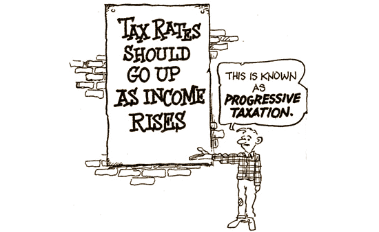
As taxes, transfers, and government spending are mostly “progressive” (in terms of those on lower incomes receiving proportionally more from transfers and spending, and paying proportionally less in tax, than those on higher incomes), then by definition inequality in market incomes will be higher than inequality in post-tax and transfer income which is higher again than inequality in final income.
These final income measures have been studied by Ron Crawford (for 1988 to 1998) and by Omar Aziz, Matthew Gibbons, Chris Ball and Emma Gorman (for 1988 to 2010), and they find that this is the case – with inequality in final income:
Final income, which is disposable income plus health and education expenditure but less indirect taxation, has been considerably more evenly distributed than market income, and has increased for almost all income deciles.
Although this is very useful, it leaves out an important point which is also missing from the prior analyses – in what ways do market prices and wages change due to the introduction of government tax, transfers, and spending?
In this way, it is important to consider all three types of income inequality – recognising that each only provides part of the information about the puzzle of what is going on.
9. Income over your lifetime – the idea of “mobility”
One issue about income inequality which we have put to the side so far is that of mobility – however, it is a big issue so it is going to get a big bullet.
Over our lifetime the amount we earn changes – there is income inequality between a young version of you and an old version of you, even if you work just as hard across your life. Furthermore, even though capital gains are often excluded from this form of analysis, the decision to sell or purchase assets (or to save) does influence the income individuals and households earn – another issue that varies over a person’s lifecycle. As people are all at different stages of their life, some income inequality in this sense seems entirely fair – as long as individuals are “mobile” in the sense that they can move up and down the income distribution over their lifetime.
Extending the paper we discussed in bullet 6 to also use longitudinal data (data that links individuals over time), Ron Crawford wrote the following paper in 2009. Focusing on mobility in labour market earnings (not overall income), this paper found that human capital accumulation (education) was important for explaining changes in earnings.
Furthermore, it suggested that mobility was greater during the recessionary period of 1997-2001 than in 2001-2004 – this is an important caveat for thinking about income mobility, it is not solely a measure of the opportunity for groups but can also be a measure of the level of social upheaval and instability!
The author suggests that the SoFIE data should be used to build a greater understanding of what is going on. A recent Treasury Working Paper, this time authored by Kristie Carter, Penny Mok and Trinh Le took on this challenge to look at the issue of income mobility – while trying to correct for some part of the lifecycle effects by concentrating on people aged between 25 and 55 at the start of the survey they used for analysis.
If no-one ever moved from one quintile of income to another quintile, then the point in time measures of income inequality that we’ve been discussing from the HES would be appropriate for thinking about the claim on resources these different income groups have over their lifetime. However, the more mobility there is, the less useful these measures are for discussing this issue.
The working paper finds that:
Also although there were strong correlations in income between years, there was substantial (relative) mobility in income. Much of the mobility was short distance to adjacent income (quintile or decile) groups. Over the long-run there was much more mobility with almost twice the amount of mobility than shown in the annual change tables.
However, even using this longer data set this paper notes there is only so much we can take out with regards to mobility – just like inequality, we need to understand the cause of mobility to truly understand whether what is going on is good or bad.

10. Using a different lens – “factors” instead of individuals/families/households
A lot of the recent attention around income inequality has not been with respect to the measures I’ve discussed above. In his 2014 blockbuster, Capital in the Twenty-First Century, Thomas Piketty focused primarily on income accruing to “factors” rather than individuals, families or households. Economists term this the “functional distribution” of income, as compared to the “personal distribution” which was discussed above.
The factors Piketty focuses on are capital and labour, and in some sense our own income is generated from some mix of both – we all have some claim on capital and some claim on (our own) labour.
We don’t currently have much research regarding this specific way of viewing inequality in New Zealand, and one of the takeaways from a recent book about the relevance of the Piketty thesis in New Zealand indicated that this is an area which requires future research.

Post-script
New Zealand’s experience with changing income inequality has been unique and complex, and defies an easy right vs wrong characterisation.
In many ways the debates we hear about inequality (and also poverty – which is a separate but related issue) within New Zealand today are not the result of some natural tendency of capitalism to drive inequality, or some ever increasing gap between the haves and have nots. Instead, it is a debate around whether the reforms of the 1980s and early 1990s shared the burden and rewards of the reforms in a way that people believe is fair.
-----------------------------------
* Matt Nolan is an economist at Infometrics, and an author at the blog TVHE. He specialises in looking at the household sector, and household economic data, but will offer an opinion on pretty much anything related to business and the social sciences.


We welcome your comments below. If you are not already registered, please register to comment
Remember we welcome robust, respectful and insightful debate. We don't welcome abusive or defamatory comments and will de-register those repeatedly making such comments. Our current comment policy is here.