

• New Zealand median house prices increased almost 18-fold between 1981 and 2019. In the same time, median household incomes increased only 5.4-fold.
• The 1970s appear to have been the glory days for house buying, with much lower interest rates and inflation than in even the early 1980s, although data is too limited for the evidence for this period to be unequivocal.
• Arguably the mid-1980s was the toughest in the last 38 years to buy a home in New Zealand.
• Today’s lower taxes and inflation mean mortgage serviceability has improved, and on paper, median income households have a far larger share of gross income available for spending on the mortgage.
• But median income households today often can’t secure loans because of small deposits and the share of gross income that would be required to service their loan, even though theoretically they could meet these payments.
Debate rages between generations. Each seems convinced the other “had it easier” in their day. If you were buying a house in the 1970s or 1980s, they were cheap relative to incomes, say today’s 20-somethings, allowing you onto the property ladder of untaxed capital gains. “We had no overseas holidays, avocado or regularly replaced cars, and had an apple crate for a dining table for the first three years,” says an older generation.
Is there validity to either view?
Headline income and house price growth
We compared median household incomes, house prices, floating mortgage rates, inflation rates, and tax regimes between 1981 and 2019 to understand the implications for servicing debt for a purchaser in each year. This was no simple task – data is hard to come by for several indicators even as recently as the 1980s. Data limitations prevented us from examining Auckland back past 1999.
Making a meaningful comparison requires some assumptions, but we can draw some headline conclusions. We know that New Zealand median house prices increased almost 18-fold between 1981 and 2019. In the same time, median household incomes increased 5.4-fold.
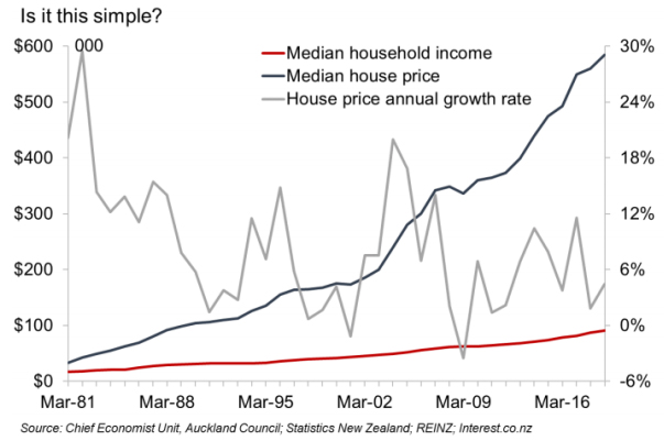
Percentagewise, recent annual national house price rises pale in comparison to the early 1980s and 2000s. National annual growth rates peaked at nearly 30% in 1982 and in the eight years including 1981 to 1988, annual growth rates were higher than in all but one year in the 2010s.
Let’s get (a little) technical
It’s important to understand what our model shows before jumping to conclusions, so we need to cover a few technical basics. We evaluate how long it would take a median income household buying the median priced house in New Zealand in March of each year to pay off the mortgage, based on a number of necessary assumptions.
We use 1981 as our benchmark year, assuming a median income household could spend 30% of its income on servicing a mortgage for a median priced house that year, with a 20% deposit. The 20% deposit and 30% of spending on the mortgage simply set the benchmark against which subsequent years are measured.
We assume that the household has a single income earner. This was almost certainly not true on average in 1981, and much less true in 2019, but it makes calculating the income tax burden of the household much easier. In reality, as the number of working adults per household has risen, average tax burdens will have fallen in percentage terms compared to what our model estimates, but childcare and transport costs will have risen, the net result being unclear.
In 1981, every dollar not spent on tax or servicing the mortgage is assumed to be available for other household spending such as groceries, clothing, electricity, holidays or transport.
Gross income – Tax – Mortgage spending = Other household spending
From 1982 onwards, we assume other household spending adjusts based on the inflation. In years of strong inflation, the dollar value spent on other household spending rose fast. If incomes didn’t rise enough to cover the rise in living costs, the money available to spend on the mortgage fell. In other words, from 1982:
Gross income – Tax – Other household spending = Money available for mortgage spending
Further, we assume a household’s ability to assemble a deposit rises in line with their income. Over the 38 years in which incomes grew one-third as fast as house prices, this has major implications for the ability to assemble a deposit.
To estimate a payback period for households that have purchased homes in recent years, we assume that incomes and inflation will continue to grow at 10-year averages of 3.5% and 1.9% respectively. We assume floating interest rates average 6.0%, the 10-year average (data limitations also force us to use floating rather than fixed rates throughout).
We make further minor assumptions to compare Auckland data to national data.
It’s pay back time
The number of years it would take to pay off the mortgage under these conditions rose from just under 10 for a household purchasing in 1981, to just under 23 years six years later. By the early 1990s, the time had fallen to just under 16 years. In the early 2000s, the time bottomed out at under 14 overall before rising through the house price boom years of 2003 to 2007.
It appears the mid-1980s were the worst time to buy, and payback periods have remained fairly constant between 1993 and 2019 in the case of New Zealand. The challenge has not been loan serviceability, but getting a loan approved with a suitable deposit in the first place.
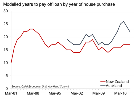
For Auckland, payback periods have always been higher as the city’s income premium hasn’t bridged the house price gap. Here it’s been a mix of the ability to secure a loan as in the first place as well as serviceability challenges. At the peak of the boom in the year to March 2017, payback periods were particularly high in Auckland, but have since moderated to just under 22 years.
Not rocket science
It’s worthwhile simply graphing payback periods against some of the key factors. As always, we’d point out that if houses are built at a rate that matches demand, prices don’t rise. But within the context of prices rising, it’s interesting to highlight their relationship to the key factors.
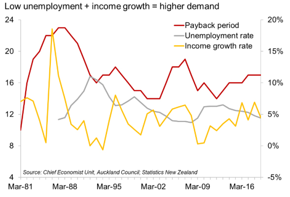
When unemployment rates were low, and incomes grew sharply, house prices rose sharply and payback periods surged, as in the mid-1980s and the years just preceding the Global Financial Crisis (see chart above). The unemployment rate and years to pay back in particular display a textbook inverse relationship. The economic slowdown in the late 1980s and the resultant rise in unemployment almost single-handedly led to payback periods for median income households moderating.
The other drivers of longer payback periods are high inflation, which is often coupled with income growth simply because wages rise to try and offset the surge in costs of living, or because wage rises stimulate inflation. Periods of high inflation meant the cost of meeting other household spending needs rose faster than incomes, leaving less money to service the mortgage unless dramatic changes in household spending patterns happened at the household level.
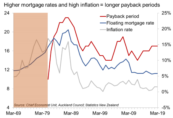
It goes without saying that higher mortgage rates meant longer payback periods as well. The extreme example was in 1981, when the payback period was only 10 years as mortgage rates were actually lower than inflation.
In interpreting the results, remember that the actual number of years given as the payback period is less important than the pattern the graph shows, as the line would move up or down based on deposit or mortgage spending assumptions.
But it’s the detail of the model and what we don’t see in the headline graphs that highlight some major differences between eras.
1980s horror or 1970s utopia?
In the mid-1980s, house prices grew fast, mortgage rates rose and inflation pushed up the cost of other household spending dramatically. These factors meant median income households would be unlikely to secure a loan at all without making massive sacrifices in terms of the 1981 benchmarked standard of living. The model is structured to allow debt to balloon in the early years as long as you can catch up later, which is obviously not an approach the banks actually take.
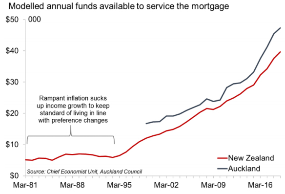
Instead, to buy at all, households would have needed to scrimp for a bigger deposit, and then scrimp some more to meet the repayments at the mortgage and inflation rates they had to deal with. Household spending needs increased in price by about 130% between 1981 and 1988 assuming Consumers Price Index (CPI) adjusted weightings and preferences were applied, while incomes rose “just” 71%. Floating mortgage rates averaged around 17% during this time.
A major frustration in this study was incomplete data for the 1970s. We do know that inflation and mortgage rates were lower through this period, and house price growth was weaker than in the 1980s. At first blush it seems likely the late 1970s were a much easier time to buy, without having to make the same sacrifices as home buyers even five years later. The 1970s was also the prime baby boomer buying era. But without median household income data, it is hard to determine conclusively that this was so.
The deposit hump
The model assumes that in 1981 the household has a 20% deposit, and that the available deposit rises in line with median household income in successive years. Because incomes rose slower than house prices, this means that by 2019, the median income household wanting to purchase would only have had a deposit of 6.1%, much less than most households would require to get a loan from their bank.
In Auckland, with much higher house prices, it’s even worse; the deposit is only about 4.6% of the median house price. Modelling shows that if the bank were to grant a loan, all other assumptions being held, the household could meet its repayment obligations. But loan-to-value restrictions and other risk management practices mean banks don’t typically lend this way.
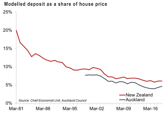
If a household were able to assemble a 20% deposit in 2019, it would reduce the payback period by about 2.5 years in New Zealand, or by almost four years in Auckland. But in Auckland, that would be a big ask, needing a lump sum of $170,000.
What inflation measures do and don’t tell us
The model increases spending on other household needs by the rate of inflation each year as measured by the CPI. Every few years the CPI revises the “basket” of goods and services it includes and the weightings it assigns to each of those goods and services to determine the weighted average increase in consumer prices. To do this, it has to examine what people spend their money on and how that changes over time.
Since 1981, some items have been removed from the CPI because they no longer play a big role in consumption patterns: offal, canned meat, delivered milk, sewing machines, VCRs, buzzy bee toys, and waterbeds (added in 1988 and removed in 1993 – the definition of a fad). Added since 1980: avocados, exotic cheese, muesli bars, free-range eggs, packaged leaf salad, craft beer, massages, cellphones and internet services.
The CPI’s job is to measure price changes, but changes in the basket mix point to bigger changes in society not captured in overall price changes: quality of life improvements evidenced by the goods and services people choose to consume today. The CPI doesn’t explicitly demonstrate the change in quantity of these higher quality goods and services consumed (other than for the purposes of weighting for inflation calculations).
The model demonstrates this by showing that if people increased spending on other household needs in line with inflation, making the preference and quantity changes described by changes to the CPI over time, today they would spend only 33% of their gross income on these needs (down from 37% in 1981). This is because over 38 years, the CPI has risen slower than incomes. Accounting for tax, aspirant home owners would have 44% of their gross household income to spend on the mortgage.
Yet this is not reality, as banks do not see a demonstrated consumer willingness to spend 44% of gross income on mortgage repayments and don’t approve lending to people on that expectation. In other words, not only have preferences changed leading to a different mix of items, but as incomes have risen, people have chosen to spend more of their income on other household spending and not primarily the mortgage. At the same time, banks have managed their risk by assuming a much lower share of income will be used on the mortgage.
That depends on what a house “is”
It is well-established that since the 1970s, the size of the average new house size has surged, even after accounting for garages being internalized into house designs, but the number of people per dwelling has fallen. This change means the median house price is buying more house than it did in the 1970s, although data gaps don’t allow us to say how much more.
A little less taxing
The income tax regime has also changed markedly since 1981. The average income tax rate for the median household has fallen by 10 percentage points, from 33% to 23% of gross household income. Because tax rates are set nationally and Aucklanders tend to earn more than the New Zealand median, the share of income going to taxes here is likely higher. As an aside, modelling the household tax burden also shows the impact of bracket creep on median income households between New Zealand’s irregular tax rate and bracket reviews.
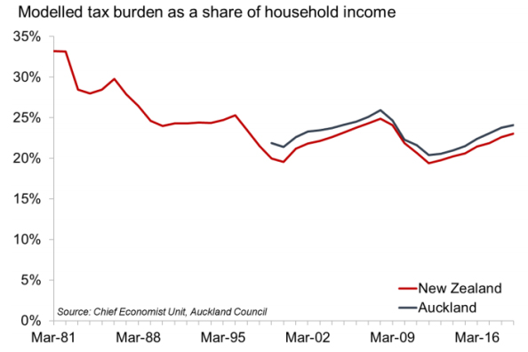
New Zealand underwent a fundamental shift in tax policy in the mid-1980s when income tax rates were sharply reduced from a maximum rate of around 66% to 33% in four years, and GST was introduced. GST is captured in price changes via the CPI, so is dealt with in the other household spending category in our model.
The summary is that all else held equal, the median income household today has at least 10% more of its gross income available than in 1981, assuming they kept their spending patterns in line with inflation and changes in preferences over time captured by the CPI. With a greater number of people per household now working, the tax burden reduction is probably a bit bigger than this.
While our model assigns this extra 10% of income to servicing the mortgage after increases in other household spending are accounted for, in reality it does not appear to be the case that people are generally using this extra money in their pockets to pay the mortgage. On its own, this would imply around 40% of the median income household’s gross income being assigned to the mortgage payments.
In conclusion
While the data doesn’t allow a complete analysis, evidence suggests the 1970s was likely an easier time to buy than the 1980s. On paper, household incomes today seem adequate to cover the cost of servicing a mortgage at the New Zealand level at least, even with small deposits.
But in reality, the combination of a small deposit and a high share of gross income going to servicing a loan appear too risky to lenders and the Reserve Bank. Further, it is evident that as technology and competition have lowered the price of various goods and services, consumers have acted in line with economic theory and consumed more of these goods and services. These choices have left less money for spending on the mortgage. Banks respond to this observed behaviour by being more cautious about how willing they are to lend.
* David Norman is chief economist at the Auckland Council. This article was first published here. It is here with permission.
We welcome your comments below. If you are not already registered, please register to comment
Remember we welcome robust, respectful and insightful debate. We don't welcome abusive or defamatory comments and will de-register those repeatedly making such comments. Our current comment policy is here.