
 By Rodney Dickens Summary: The RBNZ, Treasury and most economic forecasters are predicting that the recovery in consumer spending growth is some way off and that it will be relatively weak when it eventually arrives. The economic forecasters point to a rising unemployment rate, falling income growth and falling house prices to justify their pessimistic predictions for consumer spending growth. This Raving demonstrates that the economic forecasters don't understand how the economy actually works and in particular how recoveries in consumer spending unfold. The most useful leading indicator of consumer spending growth is the housing market and the sharp upturn in REINZ house sales over the first half of 2009 points to the potential for an upturn in consumer spending over the second half of 2009. In the Monetary Policy Statement released on 11 June the Reserve Bank of New Zealand (RBNZ) acknowledged that the upturn in house sales has traditionally been a useful leading indicator for consumer spending growth at the same time as downgrading its predictions for consumer spending growth. If that isn't bizarre I don't know what is, but when it comes to economic forecasters the bizarre can be the norm. Long version:
Comments in the RBNZ's March 2009 Monetary Policy Statement (MPS, pg 30) portray the consensus view of economists regarding the outlook for consumer spending: "the deteriorating outlook for household balance sheets and income prospects mean we now project the retrenchment of household sector spending to continue. A key factor driving the weak outlook for consumption is reduced household income, as a result of the weaker external backdrop, lower wages, declining employment and lower interest income." The red line in the left chart below shows the RBNZ's March 2009 forecasts for annual average growth in the volume of consumer spending, while the blue line shows the more pessimistic forecasts released with the June 2009 MPS. The green line in the left chart shows Treasury's forecasts as contained in the 28 May Budget. If the Treasury forecasts provide an accurate indication of what we have to look forward to over the next few years we might as well slit our wrists now! The right chart shows the average, maximum and minimum forecasts for real consumer spending growth based on the survey of 10 forecasters conducted by NZIER in March. None of these forecasters predict that consumer spending growth will recover to even the average annual rate of 3.6% experienced over the last 10 years, while based on the Treasury forecasts we won't get close to this average even by 2012/13. Yeah Right! 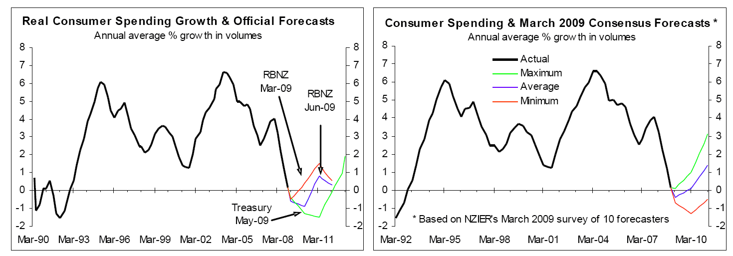 The left chart below shows the employment growth predictions by the RBNZ in the March 2009 and June 2009 MPS's (the red and blue lines respectively), and the Treasury forecasts in the 28 May Budget (green line). The right chart below shows the average, maximum and minimum predictions of the 10 forecasters surveyed by NZIER in March. These employment growth forecasts are vaguely consistent with the consumer spending growth forecasts in the charts above. It is a bit odd that the RBNZ has revised down its predictions for consumer spending growth (blue versus red lines in the left chart above) but not revised down its predictions for employment growth (blue versus red lines in the left chart below). But this is a minor issue compared to the RBNZ revising down its predictions for consumer spending growth between March and June when one of the most useful leading indicators has improved dramatically over this period (more on this later, including the RBNZ's acknowledgment it might be too pessimistic).
 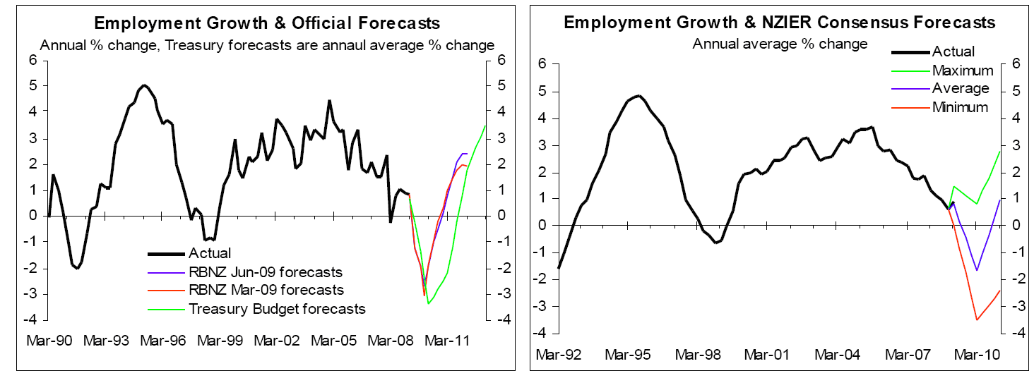 The left chart below shows what the RBNZ is predicting for the measure of labour cost inflation it focuses on most because it reflects the inflationary component of labour costs. This measure understates actual labour cost increases which also contain a real or productivity component but it gives you an indication of the RBNZ's view that overall labour cost inflation and income growth is about to slow materially. The right chart shows the results of NZIER's March survey of the 10 economic forecasts with respect to annual inflation in the QES survey of private sector hourly earnings (the blue line shows the average prediction and the red and green lines show the extreme views of individual forecasters). In the Budget released on 28 May, Treasury forecast that wage inflation, based on average ordinary time hourly earnings, will slow from 4.2% in the 2008/09 March year to 2.2% in 2009/10 and 1.2% in 2010/11 before nudging higher to 1.3% in 2011/12 and 1.6% in 2012/13. These forecasts for nominal or actual income growth move roughly in line with the Treasury's forecasts for CPI inflation, even somewhat below in 2009/10 and 2010/11, meaning no or negative growth in real or inflation-adjusted incomes. These forecasts for income growth support the predictions of weak to negative growth in real consumer spending shown above.
 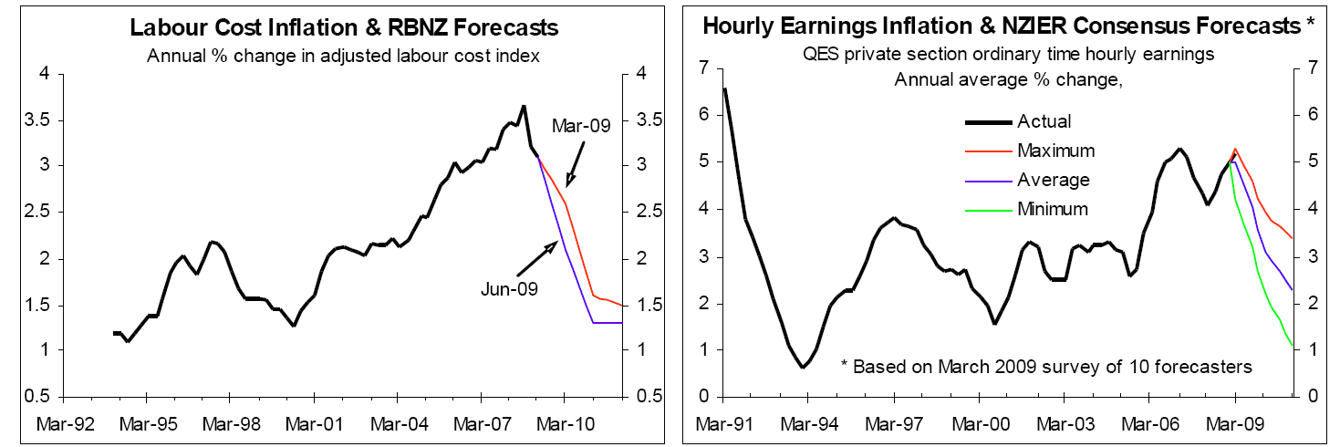 But does the orthodox approach to forecasting consumer spending growth stack up? It is understandable that economists take what they learn at university and apply it in the real world, and even to people living in the real world there is logic to the idea that employment and incomes are central to prospects for consumer spending. However, I don't swallow the party line without first checking to see whether the world works according to the prescription of textbook economics and, if it doesn't, I want to find out how it really works. So let's go on a journey of enlightenment especially about the relationship between the labour market and consumer spending growth but also touching on "household balance sheet" issues, at the end of which is a more optimistic prognosis for consumer spending growth than prescribed by the economic forecasters and especially by Treasury. It turns out that the pessimistic predictions are in part fuelled by wishful thinking on the part of the forecasters that households repair their balance sheets (i.e. spend less and save more), which isn't well founded on how people actually behave.
 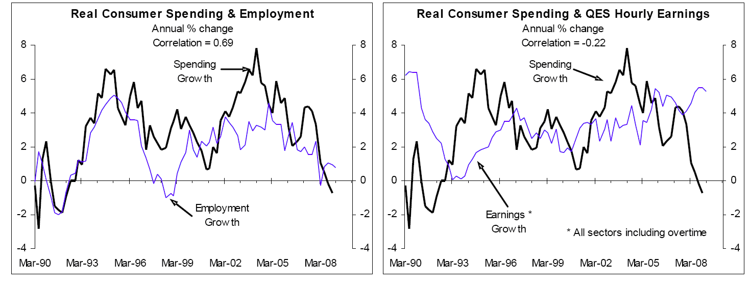 First port of call is checking the relationships between employment growth and consumer spending growth and between income growth and consumer spending growth. The left chart above shows a reasonably good relationship between employment growth and growth in consumer spending although the relationship is contemporaneous (i.e. they move up and down in synchrony rather than employment growth leading spending growth). This means they could both be driven by the same factors rather than employment growth driving consumer spending (more on this later). However, the relationship between what is probably the best measure of remuneration-related income growth and consumer spending growth shown in the right chart above is abysmal and has a negative correlation. Consumer spending growth is slightly more likely to be above average than below average when this measure of income growth is above average, while when this measure of income growth is below average, consumer spending growth is slightly more likely to be above average than below average. There is a link between the labour market and consumer spending growth but it is rather different to what the economic forecasters assume. The other issue raised by the RBNZ was "household balance sheets", which largely reflects housing wealth and mortgage debt levels. In terms of housing wealth the general view is that house prices will continue to fall this year, which will make a negative contribution to consumer spending. The left chart below shows that the best fit between consumer spending growth and house price inflation is co-incidental, as is the case with employment growth and consumer spending growth. Again, it is possible that they are both largely driven by other factors rather than housing wealth being a major driver of consumer spending. What we can draw from this is that the fall in house prices reported to date should be already reflected in the fall in consumer spending, the question is where to from here for house prices. The right chart below is a regular from our Housing Prospects reports and shows the number of dwelling/house sales reported by REINZ is a useful leading indicator of annual inflation in the QV measure of house prices (the QV measure is much better than the REINZ measure of house prices). The rise in house sales that is underway and should continue over the next few months fuelled by low interest rates and higher net migration should mean the fall in house prices is almost over with the potential that prices might start increasing before the end of the year. As covered in our pay-to-view reports, the full correction in the housing market isn't over but the stage one correction we have written about in past housing-related Ravings is all but over. And if this is the case then the further downside in consumer spending assumed by many forecasts on the back of predictions of falling house prices have dubious foundations. The comments by real estate agents in Tony Alexander's June survey of readers gives lots of anecdotes supporting our more positive view (see pages 12-14 in Tony's report. And you know that real estate agents never exaggerate (i.e. some scepticism may be warranted but the comments are an interesting read).
 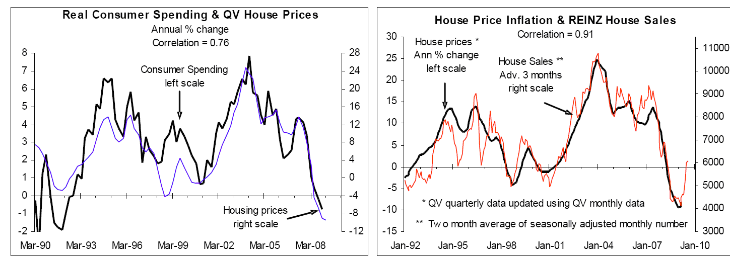 The other side of the household balance sheet is mortgage debt, which is high by any measure although there are two sides to the impact of debt on consumer spending. The first is the level of debt and the second is the level of interest rates. While interest rates remain at low levels (e.g. 1-year fixed rates at 5.5% currently versus an average of 7.9% since 1996) the burden of debt is reduced massively. For example, a $250,000 mortgage accrues $19,750 per annum in interest costs at 7.9% but $13,750 at 5.5%. So while the RBNZ remains focused on a weak recovery in consumer spending growth and keeps shorter-term fixed mortgage interest rates low then much of the burden of high debt can be avoided. The low interest rates also discourage savers and promote consumption, which is the opposite of what the RBNZ is predicting in its forecasts, but that is another topic in itself. Of course lower interest rates mean lower interest income, with this being another of the factors the RBNZ mentioned in justifying its predictions of falling consumer spending this year and a weak recovery in 2010/11. But the household sector is a net debtor so lower interest rates should provide a net stimulus to incomes and consumer spending. Then there is the fallacy of averages. The standard approach by economists is to assume that everyone is the average. In the context of debt this means everyone has truckloads of debt and the implications are that even with low interest rates borrowers are unlikely to have the capacity or desire to borrow more, while banks won't be willing to lend more. This was a common view of economists before the last housing boom when I made an easy $10 off a chief economist who, based on this sort of rationale, didn't expect annual house price inflation to exceed 10%. It is now history that annual house price inflation peaked above 20% and I ended up with an extra $10 in my pocket. While lots of people have borrowed to the max to buy a house, a holiday home or investment property and others have maxed on the credit cards, there are still lots of people with low levels of debt. This includes many of the significant number of households that haven't bought a house in the last several years. These are the people who are starting to respond to the low interest rates and buy and build houses, which is the first indication that a recovery is in the pipeline for consumer spending. Some lessons in how the economy actually works While it makes sense to the economists that we won't see a recovery in the likes of retail spending until employment growth and income growth recover the economy doesn't work like this. The left chart below shows that rather than income growth leading growth in retail sales, growth in real sales actually leads growth in probably the best measure of remuneration-related income growth. The best fit in the chart is with growth in the volume of retail sales leading growth in the QES measure of weekly earners inflation by five quarters. This is reflected in the chart by the red retail sales line being advanced or shifted to the right by five quarters. This chart points to the official measures of income growth falling sharply over the next five years as a lagged response to the collapse in retail spending (note that the right scale applies to the red retail sales line). This chart does not support the orthodox economic view that the unfolding deterioration in income growth means a deteriorating outlook for consumer spending growth. The right chart shows annual real economic or GDP growth as leading indicator of the same measure of income growth used in the left chart. The best fit this time is with GDP growth leading income growth by three quarters. So the tumble in retail sales and the recession in the economy tell us that income growth is heading lower, but the unfolding tumble in income growth doesn't mean there is imminent downside risk to growth in retail sales, total consumer spending or GDP. That latter have already happened!
 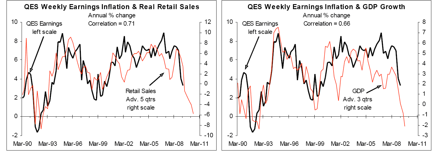 This must seem topsy-turvy but I can assure you that there is method and meaning to the seeming madness in the two charts above. How recoveries in consumer spending actual unfold is as follows: 1. Massive interest rate cuts fuel a strong upturn in REINZ house sales that generates increased income for real estate agents, lawyers, valuers and more activity in other related service industries. This is currently well underway and is followed by rising house prices, albeit that the upside in house prices this time around will probably not be very strong. 2. The upturn in REINZ house sales is followed several months later by a sharp upturn in residential building (as covered in a recent Raving), which we are starting to see the early signs of with the number of consents for new houses in April up 22% on the number in January based on the seasonally adjusted numbers. The upturn in residential building generates more income and more jobs, with the stimulus from increased house building filtering through a myriad of service industries. 3. The stimulus that started in the housing market filters through a wide range of industries with a moderate lag, including the retail sector and creates increased activity levels, increased incomes and increased employment in a range of other industries "“ the "multiplier effect". The left chart below shows that annual retail sales growth is a useful leading indicator for employment growth, with the best fit being with retail sales growth leading by one quarter. The right chart below shows annual growth in the number of REINZ house sales as a useful leading indicator of annual retail sales growth excluding the motor group, with the best fit being with growth in house sales leading by six months. The large increase in the number of REINZ house sales over the last few months shown by the red line in the right chart below points to the potential of a decent recovery in retail sales growth unfolding over the second half of the year. The upturn in retails will then play an important part in driving a recovery in employment growth. These charts start to unravel the mystery of how economic recoveries actually unfold, which is very different to the conventional or orthodox view of economists.
 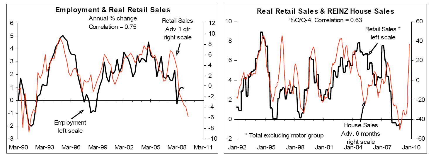 This is why focusing on the labour market as a primary driver of consumer spending growth, as the economists do, puts the cart before the horse. But not only is the housing market pointing to the prospect of a recovery in consumer spending growth well before most economists are predicting, the unfolding increase in net migration should mean the recovery is stronger than generally expected. The left chart below shows that the best fit between annual net migration and annual growth in consumer spending is coincidental while the right chart below shows that we are in the process of getting lucky. (Ed note: This was written before May migration figures were released.)
 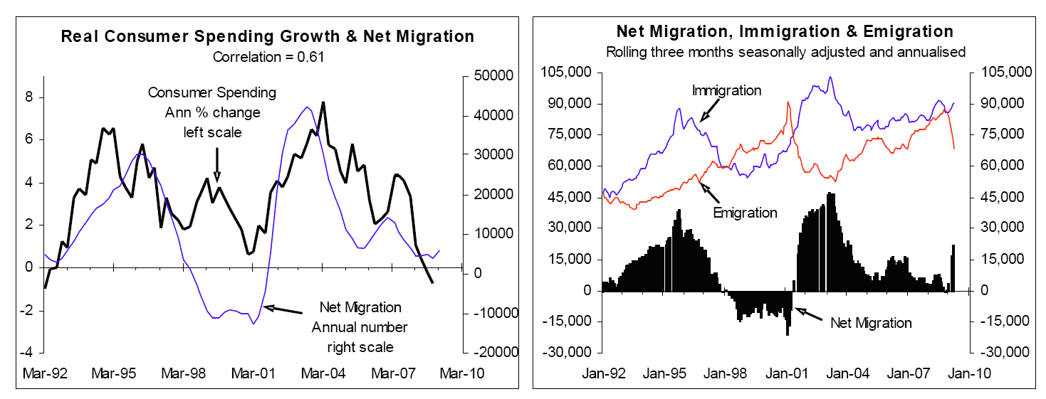 I noted with considerable interest that in the June MPS the RBNZ is taking something of a bet each way. In the RBNZ's words, "A key theme underlying the central projection is that the global economy will be more credit constrained going forward that was the case for much of this decade. One expected implication of this is that investors will be more discerning about who they lend to and the amount and price of credit they will make available. However, recent financial market developments may point to this constraint not being as binding as we think, at least for a while. If this turned out to be the case, two of the judgements underpinning the central projection could hold to a much lesser extent than we expect. The recent strength in the New Zealand dollar could be maintained or even built on, and households may be more able, or indeed willing, to take on more debt again." (Source: June 2009 MPS, page 6). The left chart below shows the RBNZ's central and alternative projections for growth in real per capita consumer spending (blue and red lines respectively). The right chart shows the RBNZ's June 2009 central and alternative assumptions for the NZD on a TWI or trade-weighted basis (the blue and red lines respectively), and the Mar-09 assumption for the exchange rate that looks a bit off the mark (see in the recent Raving that explained why the economic forecasts have got the exchange rate wrong. We will have a large helping of the alternative projections!
 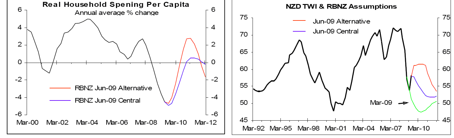 Again, the housing market upturn is telling us that a recovery in consumer spending growth shouldn't be too far away, so it strikes me as bizarre that most economic forecasters are lining up to assume the housing recovery away (see the recent Raving on this topic). The RBNZ had the following to say on this topic: "While improved housing market turnover may well continue for the next couple of months, we expect the pick-up ultimately to be short lived, and dominated by the risk of unemployment and high debt levels facing households. That said, house sales have historically proved to be an extremely good early indictor of future movements in household spending. As such, there seems a clear risk that, over the next few quarters at least, household spending turns out stronger than we currently project." (Source: MPS, page 29) The RBNZ is starting to have a bet each way, which makes the downgrading of its' predictions for consumer spending growth between the March 2009 and June 2009 MPSs look even more questionable. If you appreciate our superior approach to assessing prospects for the likes of consumer spending and housing, which in turn gives better insight into interest rate and exchange rate prospects, you might like to find out more about our monthly Interesting Times reports. We are in the business of helping clients understand how the economy actually works so they can incorporate the insights into business strategies. We are not in the business of producing mindless economic forecasts that are based on irrelevances taught in stage one economics or wishful thinking.
We welcome your comments below. If you are not already registered, please register to comment
Remember we welcome robust, respectful and insightful debate. We don't welcome abusive or defamatory comments and will de-register those repeatedly making such comments. Our current comment policy is here.