

By Amanda Morrall
Not too long ago, I linked to a column from the Motley Fool showing the comparative returns on cash in the bank vs the performance of the Australian and U.S. share market over a 30 year time frame.
Using data supplied by Index fund pioneer Vanguard, investment analyst Scott Phillips did a case study of how an investor back in 1982 with A$10,000 would have fared by 2012 if they'd put their money into cash versus, the S&P 500 or Australian equities.
For the benefit of those who might have missed it or didn't read the link, that $10,000 with a return of 8.6% (that's based on the Aussie bank bill rate) would be worth $118,000 today. A decent return but modest compared to how that same investor would have done had they invested in U.S. shares instead, which even through the global financial crisis and downturn, managed to produce 11.6% annually. That $10,000 according to the Vanguard data was calculated to be worth $271,000 by 2012 factoring in a currency conversion into Australian dollars. (Obviously the anlaysis was done for the benefit of Australian readers.) What was even more interesting was that same $10K invested in Australian equities over 30 years would have returned 12% p.a., resulting in $300,000. All the numbers above are adjusted for inflation which grew an average of 4% a year over that period.
How would that $10K were have performed if invested in New Zealand shares, vs. residential property vs. cash?
Comparisons are not so straight forward.
For one, the NZX50 has only been around, in its present form, since early 2003. The NZX has back-calculated data from 29 December 2000 and while this provides the ability to calculate returns from this date to now, in order to calculate return data for longer time periods analysts have had to stitch together the NZX50, together with NZX40 (an index for NZ's 40 largest companies) and its precedessors. The two most significant differences between the NZX 40 Index and the NZX 50 Index are (a) the NZX 40 Index was weighted by full market capitalisation, whereas the NZX 50 Index uses a Modified Free Float methodology; and (b) the NZX 50 Index contains an additional 10 companies.
FundSource, the research arm of the NZX, in its Asset Class Performance Report to June 2010 constructed an index to get 10 year and 20 year comparative data. The NZX All Index ''measures the total return which an investor might have received (before taxes and transaction costs) in the form of capital gains or losses and dividend reinvestment."
Because the returns on the various indices were calculated in different ways, the NZX All Index is an imperfect measure and yet it may serve as a crude gauge for comparing asset class performance.
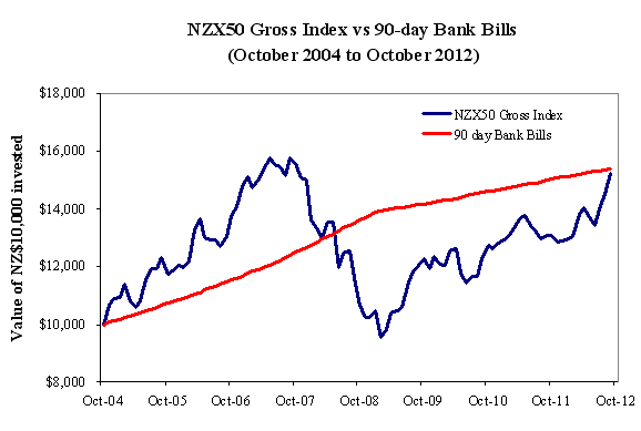
To see how an investor with $10,000 would have fared investing in NZ shares versus short term deposits we have constructed the following chart an eight-year period from October 2004 to October 2012.
Over this time frame, cash (as measured by the 90-day bill rate) actually out-performed equities (albeit barely) - by $100 or so.
source: www.finance.yahoo.com & Aon Hewitt Consulting
Invested in shares back in 2004, that $10,000 would have returned $15,226.61 compared to $15,398.46 invested in cash. That's up to the beginning of October 2012. Bear in mind those numbers do not adjust for any fees, brokerage, tax or inflation, the latter of which has run around 2.8% per annum since 2004 according to the Reserve Bank inflation calculator here.
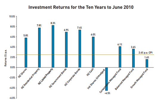
It's hardly a compelling case for equities however we can't forget markets in 2008 and 2009, took one of the worst beatings since the Great Depression. Over a longer period of time, equities historically have tended to outperform other asset classes, as illustrated in the twenty year return chart below.
According to the FundSource report in the 10 years to June 2010, cash still came ahead of shares returning 6% and 5.8% a year respectively.
As the second chart below shows, New Zealand Government bonds proved the best relative asset class performer delivering per annum returns of 8.3% over 20 years and 6.9% per annum over 10. Over 20 years, equities edged out cash; 7.3% compared to 6.7% per annum.
So how do stocks and bonds stack up to residential property?
The measurements for comparing are crude and do not reflect the experience of every investor so need to be treated with caution.*
According to FundSource's data, listed property produced the highest result with a return of 8.3% per annum over 10 years, followed by residential property at 7.8% per annum. Over 20 years, the returns on residential property drop to fifth place with a returns of 5.9% per annum, and 5.3% for listed property.
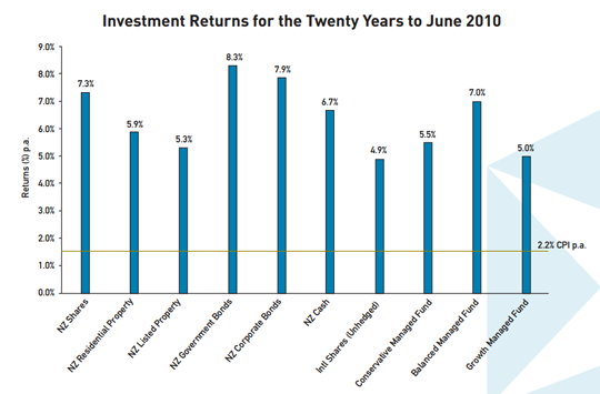
The worst performing asset class over 20 years? According to FundSource research, that would be unhedged international equities which returned on average 4.9% per annum..
Chasing the asset class with the highest returns is always a risky game and one that most always ends in tears for the investor.
At the end of the day, where you invest your money should be structured around your personal goals, your time frame for investing, your appetite for risks and the investments that you understand best. And a reminder, under the new Financial Markets Authority, only authorised financial advisors (AFA's) are able to give personalised investment advice on this question.
*Fundsource measures residential property performance based on Quotable Value Quarterly House Price Index data which takes into account the average sale prices in relation to the average capital value of properties sold as well as the volume of sales.

We welcome your comments below. If you are not already registered, please register to comment
Remember we welcome robust, respectful and insightful debate. We don't welcome abusive or defamatory comments and will de-register those repeatedly making such comments. Our current comment policy is here.