
Bernard Hickey details the eighth in our series of the Top 10 charts for 2010 in association with Bank of New Zealand.
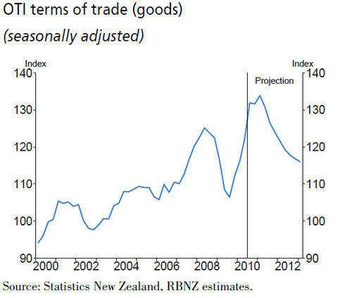
This chart below from the Reserve Bank's December quarter Monetary Policy Statement shows New Zealand's terms of trade for goods since 2000 and how it has trended up by as much as 40% over the last decade.
The Terms of Trade is a measure of the prices of New Zealand's exports in terms of the prices of New Zealand's imports.
Prices of our major commodities such as dairy and meat products have improved significantly, in particular in the last year as demand for protein from the fast growing Asian market boosts demand at the same time as supply has been constrained by higher oil prices (a proxy for feed costs in feed lot farming) and adverse weather events.
Also, the costs of many of our imported goods, such as electronics and various manufactured goods, have fallen as supplies expanded in the wake of new capacity additions from new factories in those same Asian markets. The Reserve Bank thinks this sharp improvement in the last year may not last and is expecting a drop.
The terms of trade effectively measures how much a certain volume of goods exported can buy in terms of volumes of imports.
When a country's terms of trade improve it should indicate that country has effectively become richer.
So why hasn't New Zealand gotten richer?
GDP per capita at the end of 2010 was actually lower than it was in 2004. We have gone backwards despite this exporting windfall.
Also, our net international investment position, which includes our debts and assets both here and overseas, has deteriorated over that period from being a deficit of around 75% of GDP to a deficit of around 85% of GDP.
Why can't we improve our per capital income and national wealth when we have just experienced the best terms of trade improvement in at least a generation?
I don't have an obvious answer.
Here's a few ideas.
The terms of trade measures the prices of our exports and imports of goods. It doesn't measure the price of services. We 'export' a lot of tourism and import quite a lot of financial services.
Perhaps the relative prices of these have gone against us?
Perhaps, also, the prices of our exports may have improved but we may not have improved the volumes much, while at the same time we have increased our volumes of imports?
Or perhaps, the profits from our exporting windfall have been repatriated in the forms of dividends and interest payments from foreign owned assets or foreign owned debt?
Or maybe we simply imported far more than we exported, regardless of the prices, thanks in part to a credit fueled spending spree.
It is certainly a conundrum.
I welcome your thoughts.
Here's the chart in full close up action to chew over.
We welcome your comments below. If you are not already registered, please register to comment
Remember we welcome robust, respectful and insightful debate. We don't welcome abusive or defamatory comments and will de-register those repeatedly making such comments. Our current comment policy is here.