
By Bernard Hickey
I always enjoy a good Reserve Bank Monetary Policy Statement (MPS). It's a quarterly summary of what the Reserve Bank's teams of economists are thinking at a certain point in time about the economy, the housing market, the financial system and interest rates.
It's a great snapshot of what's going right and what's going wrong inside the economy. It often explains some of the big underlying shifts and what might happen next.
Every MPS is different because it includes a fresh set of Reserve Bank forecasts and the bank often picks out certain (often topical) topics to highlight.
The December Quarter MPS this week was as fascinating as ever, which is a clear sign I need to get out more and Christmas can't come soon enough.
That aside, I thought it might be useful (and certainly fun for me) to highlight the 10 best charts from this year's MPS, explain why I think they're important and highlight what the bank said about them in the quoted bits under the charts.
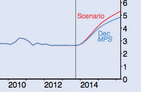
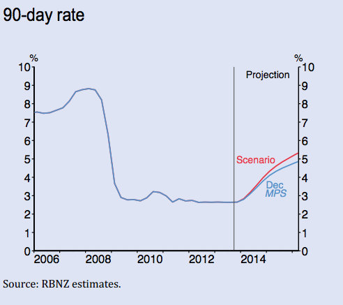
1. The one that matters
This chart shows where the Reserve Bank thinks the 90 day bill rate will be over the next two and a bit years.
Traditionally it is seen as a proxy for where the Reserve Bank is forecasting the Official Cash Rate (OCR) will go, but the bank has previously been careful not to equate the two very directly. It's the first chart I turn to every time and it's often where I think the 'news' can be found in any MPS. It essentially sums up where the Reserve Bank thinks it needs to set interest rates to keep inflation around 2%, given where it thinks economic growth is headed and in particular where it thinks commodity prices and the currency are headed.
This time Governor Graeme Wheeler was very specific in the news conference about saying the bank expected the OCR to rise 2.25% from 2.5% to 4.75% by the first quarter of 2016. This warning is directly in line with this 90 day bill track forecast.
This is a form of 'forward guidance' that aims to get as much 'bang from the buck' from the warning as the actual interest rate increase itself. The Reserve Bank is thinking more these days about these communcation effects. The first time the Governor did this in a most direct way was in his Herald Op-Ed in October when he said he mortgage rates could rise to 7-8% over the next two years, based on the Reserve Bank's 90 day bill forecast. Deputy Governor Geoff Bascand said in a speech last week the Governor's comment, even though it was not new because it was simply a restatement of the 90 day bill track forecast in the September MPS, was surprising for the public.
It would not have been if they'd known about this chart, which I see in true Hobbit style as the 'One Ring' of the Reserve Bank MPS. It is the 'My Precious' of the monetary policy world. It shows how the Reserve Bank's forecasts have changed since its last MPS. The red line is 'last time' and the blue line is 'this time.'
Enjoy.
The 90-day interest rate is projected to rise over the next few years by slightly more than we envisaged in the September Monetary Policy Statement (figure 2.4) This reflects the view that the terms of trade and domestic demand are somewhat stronger than foreseen in September. The effect of these factors is partially offset by a higher exchange rate than was assumed at the time of the September Statement
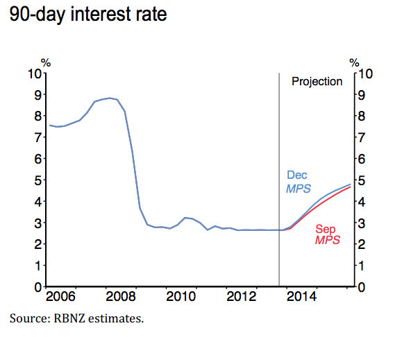
2. Even higher house prices
The Reserve Bank increased its forecast for house price inflation in the December MPS from the September MPS because of stronger than expected net inward migration. It noted the soft labour market in Australia may further increase house prices and "pose upside risk to house price inflation."
The bank said it was early days, but the impact from its high LVR speed limit introduced on October 1 was broadly as expected. It still expected it to subtract 1-4% from annual house price inflation in its first year. Later in the MPS it said it was assuming the high LVR policy would subtract 2.5% from house price inflation in the first year.
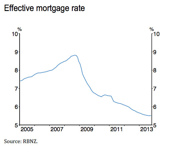
3. No wonder house prices are rising
This chart shows the effective mortgage rate after taking into account how many people are on fixed mortgages vs floating and what they're paying in weighted average terms.
You could argue it's a good measure of the effective monetary policy for households and small businesses with over NZ$180 billion of mortgages.
It shows how the effective mortgage rate has been falling since March 2011 despite the Official Cash Rate remaining flat at 2.5%. That's because an increasing proportion of floating rate borrowers have moved to fixed rates. By the end of October the floating share had fallen to 43%, but the Reserve Bank pointed out that the portion of mortgages that are either floating or fixed for less than a year was 74%, well above the trough of 37% seen in mid 2007.
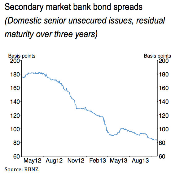
4. Here's why the effective mortgage rate fell
This chart shows how the cost of wholesale long term borrowing by banks has fallen by about 100 basis points over the last 18 months. That gave the banks the 'ammo' to offer cheaper fixed mortgage deals. The Reserve Bank also pointed out that banks were getting plenty of easy and cheap term deposit money, which was growing at 10% per annum despite the banks easing back on competition for such funds now they have comfortably met their Reserve Bank-set targets for stable 'core' funding.
Banks were paying almost 200 basis points over the one year swap rate for one year term deposits in 2012. That has fallen to just over 100 basis points, while six month term deposit funds had fallen to 100 basis points over from 160 basis points.
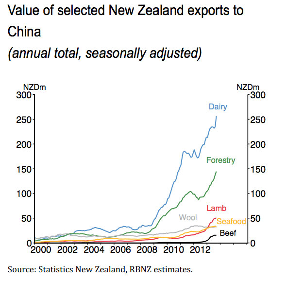
5. Yay! Give thanks to the FTA
I'm sure this chart showing the seasonally adjusted value of various commodity exports to China is around elsewhere, but it the sheer scale of the surge and the steepness of the curve is astonishing.
6. Why our current account is in deficit
This chart shows you what happens when your currency strengthens in a structural way. It changes the way the economy behaves.
This shows a dip down in the import share of the economy during the recession when the currency slumped and we all felt poorer and less interested in buying imports. The strength of the economy has turned us right back on to importing consumer goods and some capital goods for investment. It shows we're headed right back to the bad old days of debt-fueled consumption spending on imports that drives a big current account deficit.
The Reserve Bank is forecasting a 5.8% current account deficit by the year to the end of March 2016. That's despite the chart above and the Terms of Trade at the best levels since 1973, which perhaps ironically, was the last year New Zealand ran a current account surplus.
It also casts a shadow on the Government's stated target of raising the export share of GDP by 10% to 40% by 2025.
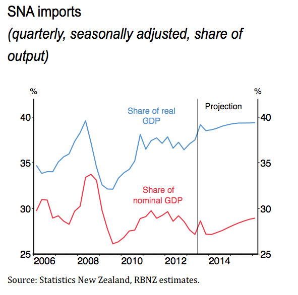
The high New Zealand dollar is expected to continue to dampen export revenues and support high import penetration, therefore weighing on net exports and growth. Favourable import prices improve the purchasing power of firms and households enabling a strengthening in the volumes of imported goods.
7. What if dairy prices don't fall?
The Reserve Bank included in its 'Box C' a scenario for the Terms of Trade staying high, rather than falling as the central Reserve Bank scenario indicates. Even though the New Zealand dollar would also rise, the increased income from the high export prices would put upward pressure on inflation, forcing the bank to increase the OCR by an extra 40 basis points. This would suggest that mortgage rates would rise to something like 8.5% by early 2016, rather than the 8% currently forecast, if dairy prices in particular stay elevated.
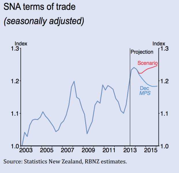
A possible driver of higher terms of trade over the medium term could be stronger consumption growth in China that boosts prices for commodities such as dairy, lamb and beef. Proposed reforms in China – announced after the Third Party Plenum in November – could benefit demand for New Zealand’s export products over the next decade.
The driver of the stronger terms of trade is a long-lasting increase in New Zealand’s export prices, with all else unchanged. The higher terms of trade boosts domestic incomes, and so consumption and output. This results in greater pressure on productive resources and stronger non-tradables inflation At the same time, the New Zealand dollar is higher because of the stronger outlook for the New Zealand economy (and so interest rates).
The higher New Zealand dollar dampens output growth, through weaker net exports. The stronger exchange rate also directly lowers inflation in the prices of tradable goods, which partly offsets the non-tradables inflationary pressures associated with stronger domestic demand. Nonetheless, in order to offset building inflationary pressure, the 90-day rate needs to increase by more than in the central projection.
8. What that higher Terms of Trade would mean
The Reserve Bank forecast that it would have to hike rates by as much as 40 basis points more than it currently forecast if the Terms of Trade stay elevated.
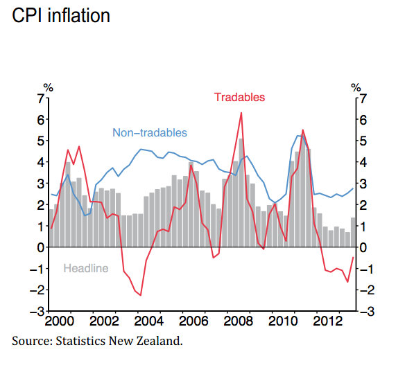
9. A deflationary drag
The strong New Zealand dollar and surplus production capacity overseas means there has actually been deflation in the tradeables sector (red line), which includes those where prices are competitive internationally.
Non-tradeables inflation, where prices are set locally, has been much higher and the Reserve Bank forecasts it will rise towards 4% as pressure on capacity grows. It also pointed out that higher indirect taxes on tobacco and petrol would add 0.3% respectively to the inflation rate each year until 2016. This is helping to offset some of the 2% dampening of GNP demand from the Government's restraint on spending.
The Reserve Bank is also assuming that downward pressure on mobile and broadband prices will help contain inflation. It even mentioned the Commerce Commission's controversial decision to cut copper broadband prices. That assumption about deflation in broadband may itself be controversial, given Telecommunications Minister Amy Adams has said she does not expect retail telecommunications companies to pass on much of the wholesale price cut regulated by the Commission.
Since the September Statement, the Commerce Commission has announced its final decision on the price that Chorus can charge retail internet service providers for use of its copper line and copper broadband service. We assume that this pricing will come into effect in late 2014 and place downwards pressure on annual CPI inflation, but will review that assumption as needed in response to further information.
While the exact magnitude of the effect is uncertain, it is expected to be enough to reduce headline inflation somewhat over the latter part of the projection and affect the headline inflation profile from the September 2014 quarter.
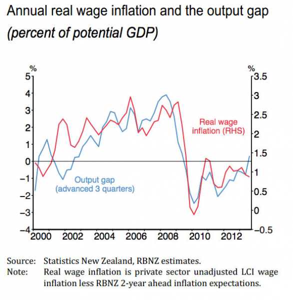
10. Here comes some wage inflation
This chart shows the close connection between what the Reserve Bank measures as the output gap (blue line) and real wage inflation (red line), which has been very weak since the 2008 recession at around 0.5-1%. The blue line has just gone into positive territory so (in theory) real wages should start to accelerate back to 2004 to 2008 levels. We'll see.
5 Comments
Love all the up ticks. All I see is flat lines.
If only - academic forecasting exercises are not the stuff of central bank policy making.
Those charged with the responsibility for determining the outcomes of the 90 day bill rate are shadowy figures unknown to the genral public for their direct meddling in affairs supposedly meant for others to determine.
Ex FOMC member, Wliiliam Poole examines the situation as it pertains to the US Federal Reserve with an eye of insider experience:
Ben Bernanke talks a lot about risk management and the tradeoff between benefits and costs; he maintains that the need to balance these two issues justifies proceeding with the current policy. But Bernanke does not discuss the risk of political intervention in Fed policy despite numerous examples of the Fed giving in to political pressure and waiting too long to change its policy, which results in a detrimental outcome for the economy.
Essentially, pressure on the Fed will come from inside the government and may not be very visible; it may be limited to a few op-ed articles from the housing lobby. [FFW – presumably, Poole intended “it” to refer to the visible part of the pressure.] The true amount of political pressure will be largely hidden.
[T]he real issue is the politics of monetary policy … I believe that the Fed will not successfully resist the political winds that buffet it. I am not a political expert or a political analyst by trade. My qualification for speaking on this topic is that I have followed the interactions between monetary policy and politics for a very long time. As with all things political, the politics of the Fed means that realities often fail to match outward appearances … I believe the Fed is likely to overdo its current QE policy of purchasing $45 billion of Treasuries and $40 billion of MBSs per month. Read more
#1
Bernard, if i drew a chart of my predition of your net wealth over the next 2 years. From my projection point i just draw a line going up, and say Bernard, your net wealth is going to treble ove the next two years. Would you be gullable enough nto belive me.
No erxplanation - nothing, i just draw a graph going up
Yuppity doo your going to be rich. Maybe we could all get rich that way so lets all draw graphs to our own liking
Very true.
Interesting the RB doesn't hold much hope of commodities retaining their current high prices, judging by their forecast on chart 7.If the Fed does taper and we see more sustainable data come out of the US next year,one would be thinking commodities will benefit from more "risk on" activity. I'd love to see their thinking on what they believe the Fed will do in 2014 but I guess we will never get to see those kinds of juicy forecasts.
We welcome your comments below. If you are not already registered, please register to comment
Remember we welcome robust, respectful and insightful debate. We don't welcome abusive or defamatory comments and will de-register those repeatedly making such comments. Our current comment policy is here.