

Today's Top 10 comes from interest.co.nz's Gareth Vaughan and David Chaston.
As always, we welcome your additions in the comments below or via email to david.chaston@interest.co.nz.
And if you're interested in contributing the occasional Top 10 yourself, contact gareth.vaughan@interest.co.nz.
See all previous Top 10s here.
Due to my (Gareth's) oversight at organising a guest Top 10 contributor this week we were left with a hole to fill at short notice. We at interest.co.nz love a good chart and we know many of our readers do too. Thus the idea of a Top 10 of charts, or chart porn as we sometimes joke, was born. So here goes.

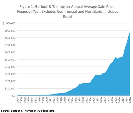
1) Where better to start than with Auckland house prices? Our first chart comes courtesy of the Auckland University of Technology's John Tookey. It's included in his new report entitled, The mess we're in: Auckland's housing bubble from a construction sector perspective. It's a chart of Barfoot & Thompson's annual average Auckland house sales price, dating back to the mid-1950s. Quite a spike over the past few years...
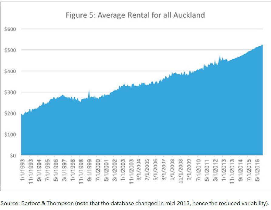
2) The second chart also comes from Tookey and B&T. This one's the average Auckland rental. It doesn't go back nearly as far as the house price chart, but nonetheless still paints quite a different picture.
Below are some of the conclusions drawn in Tookey's report.
The fact is that, on housing, we are in a mess. A huge mess. The bubble is inflating further and, as a society, we are – for entirely rational reasons – continuing the behaviours that created it. To quote Albert Einstein: “We cannot solve our problems with the same thinking we used when we created them”. The solution to this mess is inevitably governmental policy that compels market behaviour. We cannot leave matters to the free market and then continue to be stunned by the inconvenient fact that the market acts in its own best interests. Developers, builders, house buyers and the public all act for their own best interests. These stakeholders will not act as charities, pro bono publico. To think otherwise is naïve in the extreme.
He suggests the use of both carrots and sticks to combat the problems.
A meaningful response to the housing bubble will have two things at hand: sticks and carrots. Starting with the sticks, there are various ways to take pressure out of the market by disincentivising property speculation and the buy-to-let model for additional property acquisition. Typical methods adopted by governments around the world include a capital gains tax that could be incremented according to the number of properties held. However we need to focus on the broader solution of delivering large numbers of properties outside of the normal market delivery rate. In other words, we need to get ahead of existing demand, which is currently attenuated by the drip-feeding of properties into the market to maintain values.
And he floats an interesting idea to incentivise residential property investors to sell up.
A more sophisticated alternative to the sticks approach is to hold a carrot in the other hand – that is, to adopt incentives that encourage buy-to-let landlords to sell their properties in the short term, while at the same time disincentivising them from buying back for the same purpose. The ideal effect would be to ‘vire’ properties from the rental property sector to the owner occupancy sector – that is, to transfer them from one account to another. One strategy would be to use tax law and capital gains protection (assuming the prior introduction of a capital gains tax) as an incentive to sell rental properties into the owner-occupier sector. For example, allowing one-off investment of capital gain on rental property sale to enter tax free into a KiwiSaver account. This would have the effect of freeing up more property and capitalising the NZX for future investment in the economy.
(And here's Tookey in one of our Double Shot video interviews with Greg Ninness from last year).
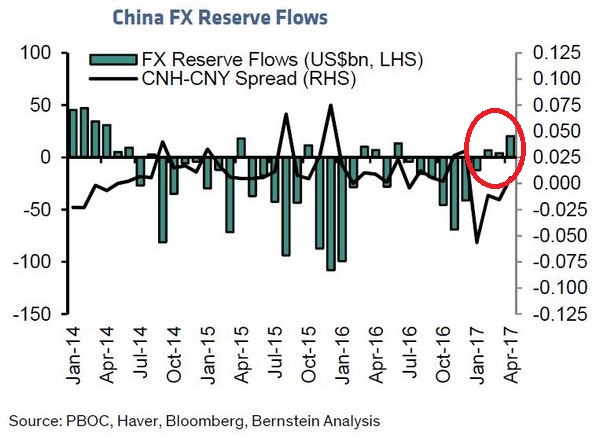
3) Sticking with the Auckland housing market theme, this chart comes from a research report by Hong Kong-based ex-pat Kiwi and Bernstein equity strategist Michael Parker and his colleague Kelman Li. It shows how successful Chinese authorities have been over recent months in turning around capital flight. The red circle was added by me. As interest.co.nz's Greg Ninness has reported including here, there has been a notable drop off in ethnic Chinese buyers at Auckland property auctions over recent months.
Obviously other factors are at play too. Notably the 40% deposit requirement for residential property investors introduced by the Reserve Bank last year. But with the latest monthly Real Estate Institute of New Zealand figures showing the Auckland median price down $50,500, or 5.6%, to $854,500 in April from March's record high of $905,000, and the North Shore median down a whopping $115,000, surely the slowdown of money coming in from China is a, or potentially the, key driver.
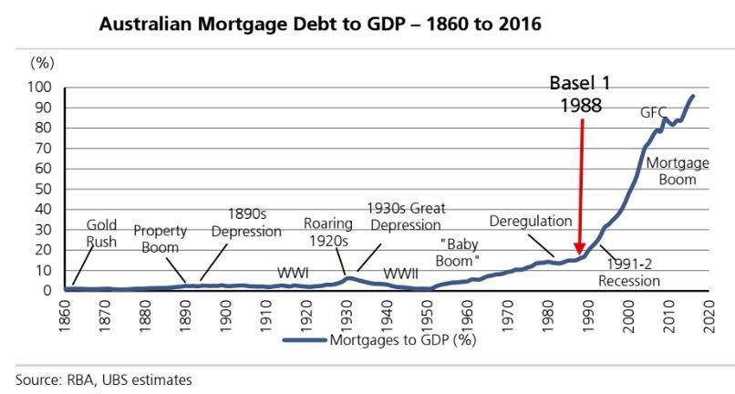
4) The controversial Basel banking regulations. This chart, from UBS, is timely given the Reserve Bank is embarking on a wide ranging review of banks' capital adequacy requirements. We're now into the third iteration of Basel. The UBS chart demonstrates how the Australian mortgage boom took off after Basel I was introduced. Undoubtedly there were other factors at play too. But the way the Basel standards incentivise banks to lend against residential property has been a key one.
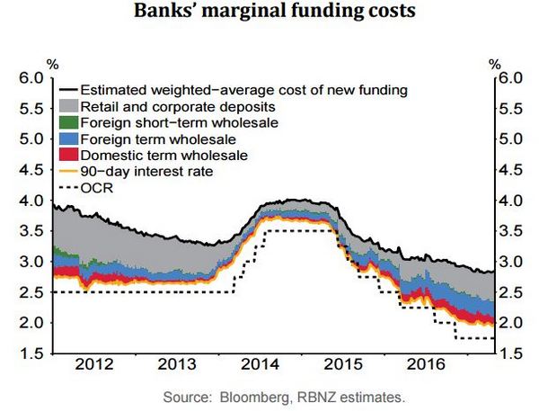
5) Bank funding costs. Bank executives are constantly telling us their funding costs are rising and are "decoupled" from the Official Cash Rate. This chart, from the Reserve Bank's latest Monetary Policy Statement (MPS), shows funding costs have been falling over the past few years. As I reported last month, figures from KPMG's latest quarterly Financial Institutions Performance Survey show bank funding costs down 30% in two years.
However, all four major New Zealand banks have reported chunky falls in their net interest margins in their latest financial results. The drops, year-on-year, range from 10 basis points to 22 basis points. The net interest margins reported range from 1.96% to 2.30%, which remain strong by international standards.
Interestingly, the pressure is coming from deposit rates, which might be news to some long term savers given how low their interest rates have been for so long. If you are When you are bargaining with banks over your deposit rates, keep in mind that they really need deposits. Both to help them meet the Reserve Bank's Core Funding Ratio, and in the case of our Aussie owned banks, to also meet the Australian Prudential Regulation Authority's Net Stable Funding Ratio.
Here's the Reserve Bank from the MPS on funding costs;
The decline in global bond yields in recent months has flowed through to wholesale interest rates in New Zealand. While wholesale funding conditions have eased since the February Statement, domestic deposit rates continue to put upward pressure on banks’ marginal funding costs.
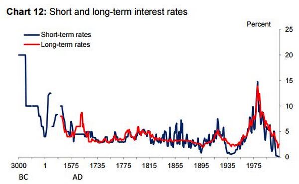
6) Admittedly this chart comes from a speech given by Bank of England chief economist Andrew Haldane in February 2015. So it's not exactly freshly minted. I've used it at least once before, and it has appeared in various publications around the world. But it's worth one more look. Haldane and his team tracked interest rates back 5,000 years to demonstrate just how low they've been in a historical context over recent years.
Here's Haldane from that speech.
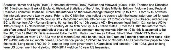
Chart 12 plots a measure of short and long-term interest rates back to 3000 BC. Though the data are patchy, they suggest interest rates fell secularly in the run-up to the Industrial Revolution, from double-digits to around 3%. Alternative interest rates, such as the rate of return on physical assets such as land, show a similar pattern.
One interpretation of these trends is that they reflect society’s evolving time preferences. In the run-up to the Industrial Revolution, society became more willing to wait than in the past. That, in turn, enabled saving, investment and ultimately growth. Patience was a virtue. But if society’s time preferences were indeed shifting, that still begs the question why?
Here, we can enlist some outside help. Experimental research over the past 50 years, by psychologists and neurologists, has taught us a great deal both about the determinants of patience and how it affects behaviour. This can perhaps provide insights into some of the historical drivers of a more patient, and hence higher growth, society.
One important driver of patience is income and wealth. The lower income, the more impatient is human decision-making. Why? Because surviving on limited means absorbs huge amounts of cognitive energy. It causes a neurological focus on the near-term. This myopic thinking has been found in everything from under-saving for retirement to over-borrowing from pay-day lenders. In developing countries, it may help explain poverty traps.
Now I hand over to David Chaston.
7) How our banks fund their loan books.
Our banks have way too little equity. Bank shareholders get their high returns because they use other's money to operate their businesses. I often point out to bankers that they would never tolerate lending to a business with a balance sheet like theirs. But let's look past that issue for a moment.
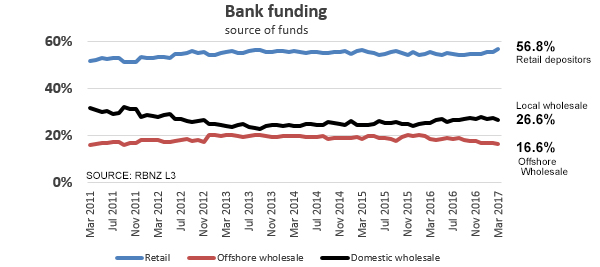
This chart is about where they get "other people's money". This chart is of term funding, and does not include the on-call/overnight portion. (Less than 0.5% of at-call funding is from offshore sources.)
This is instructive for those who engage in cheap bank-bashing. And I suspect the above facts will be a surprise to them.
Essentially, 83.4% of committed bank funds is sourced locally. And that proportion is rising.
The proportion being funded from offshore sources is just 16.6% and that is the lowest level since March 2011 when this RBNZ data started.
And the funding by local term deposits is at its highest level ever at 56.8%, at least since this data series started. It is true that banks need that offshore source, but they are making good progress weaning themselves off it.
8) How offshore investors regard NZ's sovereign bond risk.
Investors buy bonds that have maturities five, 10, 20, 30 years in the future or even longer. As the risk of default grows over longer periods, they can insure against that risk by buying a credit default swap (CDS) contract. These types of derivative contracts have become a huge business (because the bond market is itself huge). They do allow the rest of us to track investor confidence in both corporate and sovereign bonds.
And as you can see here, these investors have fallen in love with our sovereign debt, ranking it with some major benchmark economies, and as better than many large ones. The improvement has been substantial over the past few years and has no doubt saved the NZ Treasury substantial amounts in interest costs.
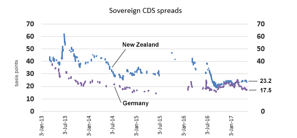
We are comparing New Zealand to Germany here primarily because Germany is among the lowest around. The Swiss may be lower but we don't have their data. But here are the current CDS spreads for the usual suspects we compare ourselves to: The USA is 22.2, the UK is 28, Australia is 26, Sweden is 20, France is 29 (although before the election it got up to almost 70), China is 80, and Japan is 25. Norway is the best at 15.
We are batting in a heavy-hitter lineup and performing very creditably in the risk-perception stakes.
At the other end of the scale, countries we don't usually compare ourselves to include Venezuela at 3,170, South Africa at 190, and South Korea at 57.
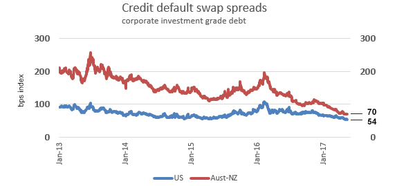
9) So let's look at corporate (investment grade) debt CDS spreads as well.
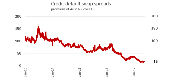
We don't have ready (free) access to New Zealand corporate debt CDS spreads. The best we can track is the "Australasian" index released daily by Markit. The investment grade index covers both bank debt and other debt, mainly from Aussie miners and resource companies. But the bank debt portion is a sizeable weight in this index. The reduction of risk assigned by these market forces is also impressive. And the improvement over equivalent American investment grade corporate debt is substantial.
The next chart tracks that difference. It has never been as low.
10) Gold.
Like most people following "the markets" we include our daily tracking of gold. But I sometimes wonder why. The gold price reacts to risk issues in a very minor way these days. And the fundamental demand underpinnings seem to be going nowhere. Here is the latest data from the World Gold Council, the industry body charged with spruiking the commodity class. They are up against it as these longer term charts reveal.
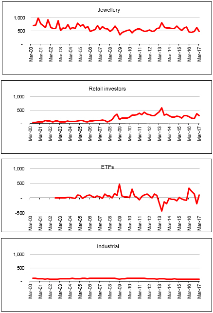
If it wasn't for the poor old [gullible ?] retail "investors", I suspect the bottom would drop out of this market. The global jewellery demand has been steadily falling, the big hedge funds have lost interest after loosing a bucket load on false calls, and there is virtually no industrial demand.

We welcome your comments below. If you are not already registered, please register to comment
Remember we welcome robust, respectful and insightful debate. We don't welcome abusive or defamatory comments and will de-register those repeatedly making such comments. Our current comment policy is here.